Processes & Structures

Final Project by Annie Silverman

Journal Writing:

In thinking back on all of the materials you explored this semester, which ones did you especially enjoy working with? Why? Which materials were most challenging to/for you? In what ways were they challenging? What surprised you about your work with our course materials this semester?

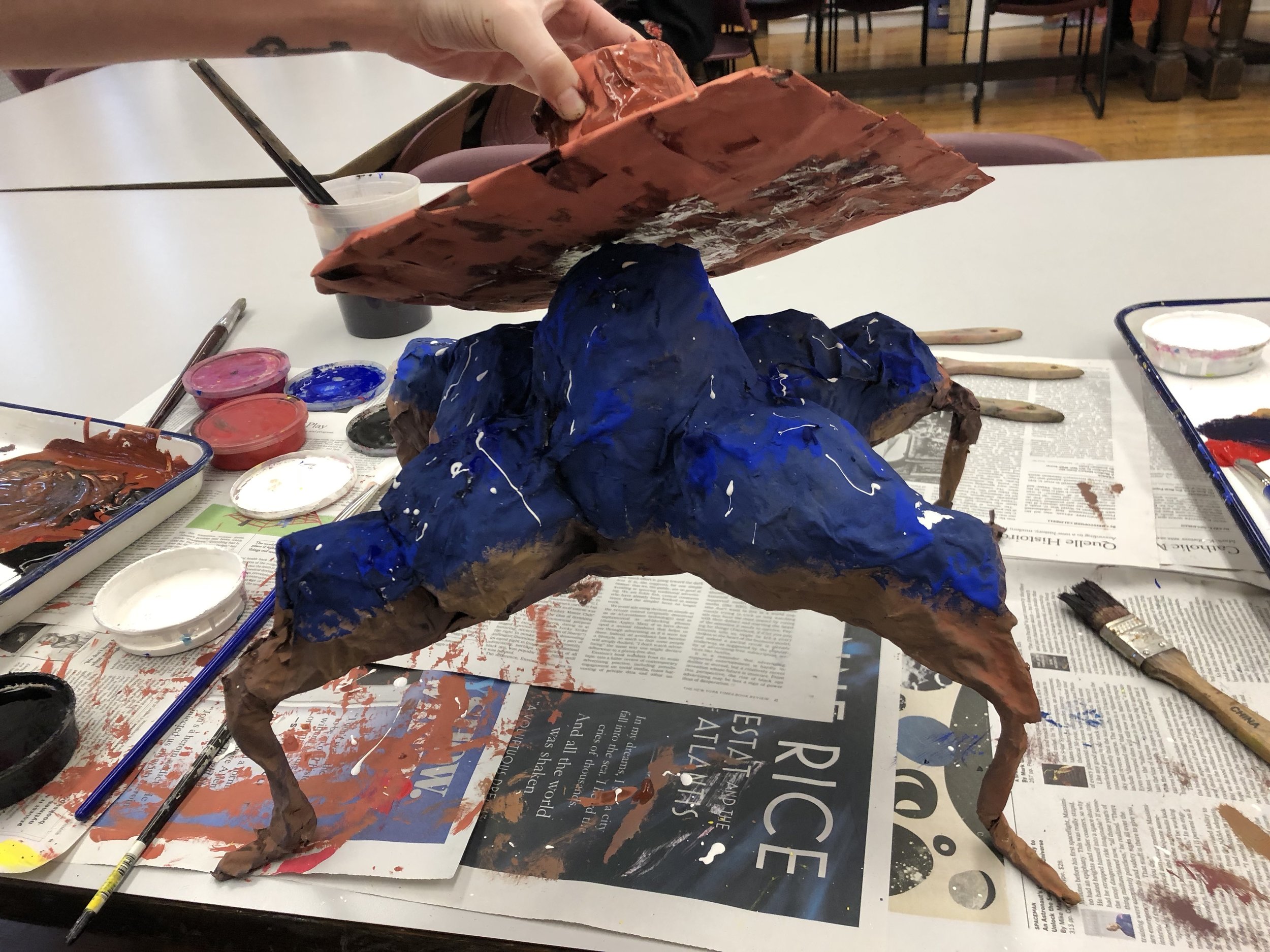
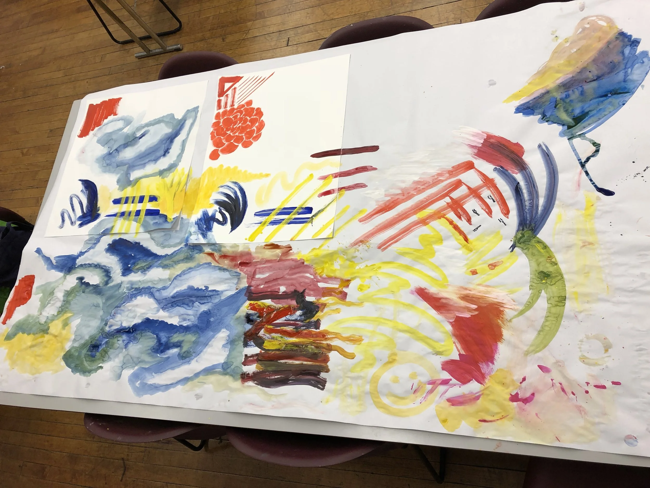
Thinking back on the semester makes me reminisce about working with fabric, drawing, painting, and paper mâché. I really enjoyed working with fabric because it was one of the first materials that we explored in class. I also had not worked with fabric much in my own artwork, and I was able to prove to myself that I could work with this material. What I also enjoyed about this material was that I was able to work with a group and compare the way that we encountered the material differently. The next medium that I really enjoyed working with were drawing materials. As an artist, my training background is in drawing and painting. Working in drawing gave me time to work with materials that I love returning to, and learning how to utilize them in my future classroom differently than I was taught. Besides drawing, my artistic background has been heavily influenced by painting materials. I fell in love with painting when I encountered oil paints at a summer program at the University of the Arts in Philadelphia. Working with painting materials in class gave me a fun opportunity to revisit why I love painting. I also learned a new way that students can approach painting for the first time, without making them feel insecure or nervous about it. Lastly, I really liked working with paper mâché because I was able to explore a material that I have not encountered since elementary school. I also liked working with a partner with a different artistic and education background from me. My partner liked working with different materials and themes that I did in her art. She also is a preschool teacher, which is much different than my vocational aspirations to be a high school art teacher. 

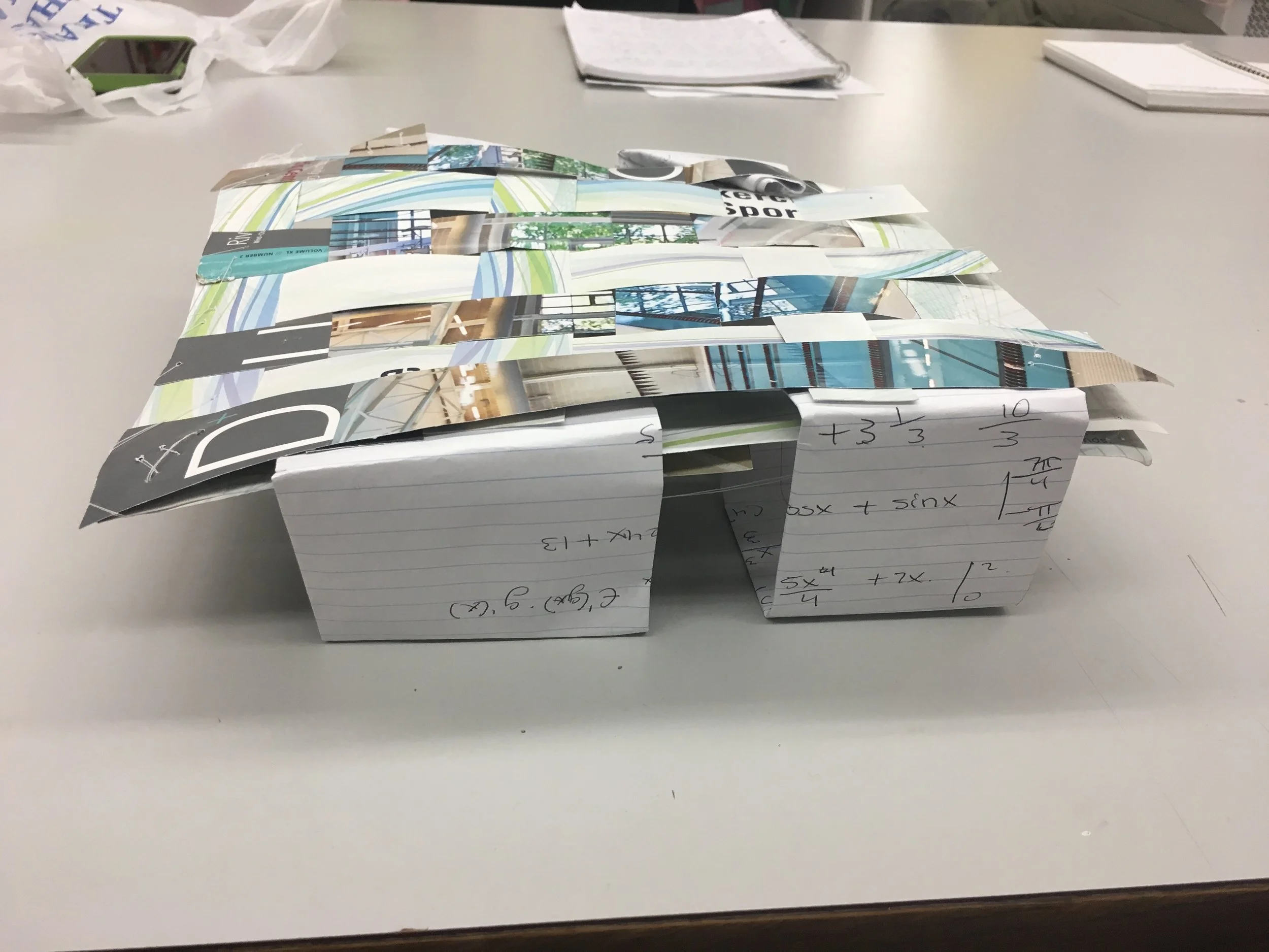
The material that were most challenging for me was printmaking. It was challenging because of my previous experience with printmaking and my preconceived opinions about the medium. In the past, I have done drypoint, silk screen, and linoleum printmaking, but none of my teachers that I had approached printmaking in an exploratory way. I had always done assignments with printmaking that asked me complete certain tasks. Exploring printmaking in class was a challenge because I had tried to create something specific instead of exploring what kinds of studio approaches I could take to understand the material better. 

This semester, I was most surprised with how I used, encountered, and executed projects. In the beginning of the semester I approached projects with an uncertainty of what was expected of me because of the open-ended nature of the prompts. Despite this, I was able to use materials to their fullest extent and learned more about their characteristics and limitations. The way that I had learned to encounter materials and assignments changed as I also got to know myself as a working artist. I found that the projects that I learned the most from were the ones where I gave myself a personal challenge with the material. With this, I executed projects differently from my peers and came to class with different results. I was surprised that I was able to create successful products that improved my problem solving in art, and my ideals for introducing my future students to materials.

My Project Idea:

I was inspired by the book I am currently reading, The Beautiful and Damned by F. Scott Fitzgerald, and my CTIP Site. CTIP is an internship I was assigned by the class called Field Observations to observe how an art teacher works collaboratively with classroom teachers to effectively aid students learning in academics and fine art. The students were reading the book Charlotte's Web, and my CTIP art teacher decided that the students would do styrofoam printmaking to aid their understanding of the characters. Their project was to create three plates of the characters they like most. In the art room, they also learned about color theory, which inks show up on what colored paper, and how to represent a characters tone/characteristics through color. To help their textual evidence and reading comprehension, the students learned about different line weights and strokes that give background of what is going on in the illustrations within the book. With this idea in mind, I decided to do something similar in my project.

I wanted to find a way to modify this lesson for older students and grades. The lesson objective of this project would be to get students to practice visual representation of complex meanings/concepts/ideals. This way, they would be able to do the same in their own work. I figured that a lesson like this would be great because it would get students to translate one medium to another, text to visual. I also thought that it would speak to students interests because they would be able to choose their favorite book and be personally invested. The lesson would require students to translate themes, time period, or characters from the book and make them visual through printmaking.

In the case of my project, I would be re-presenting the book The Beautiful and Damned through the time period that it takes place. The book takes place in the 1920's when Art Deco design was most popular. I expect that my project will be heavily based in simple geometric shapes and limited colors.

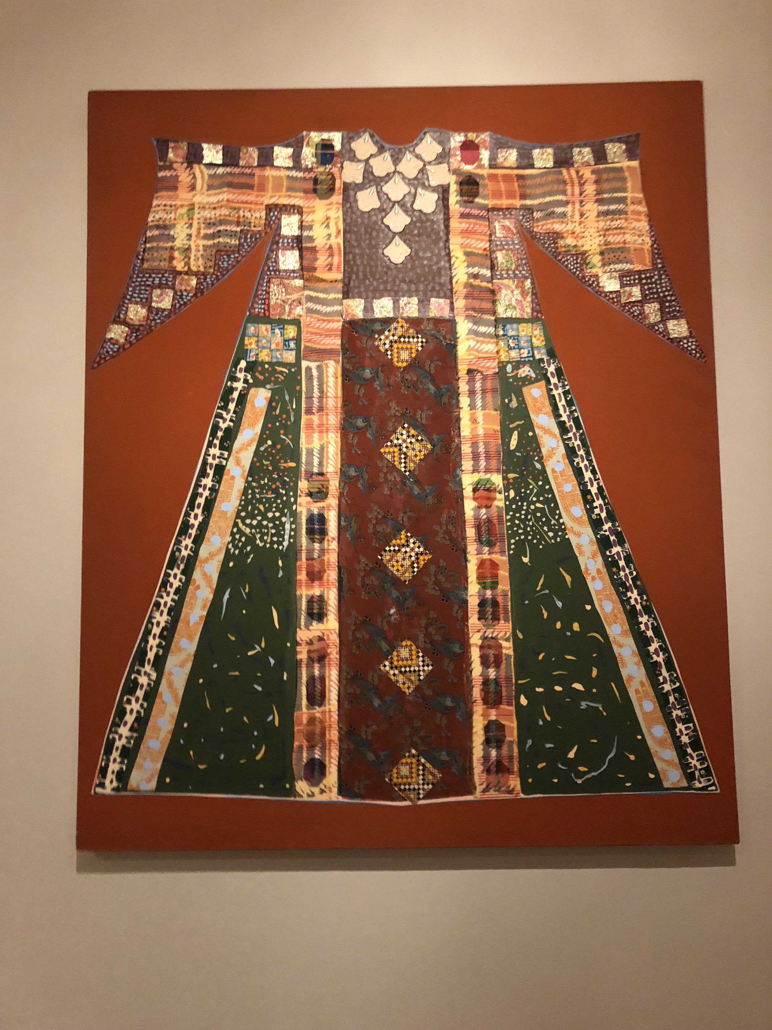
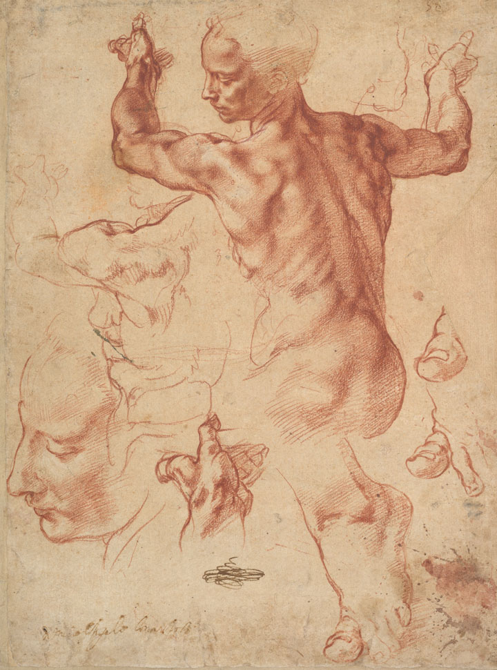
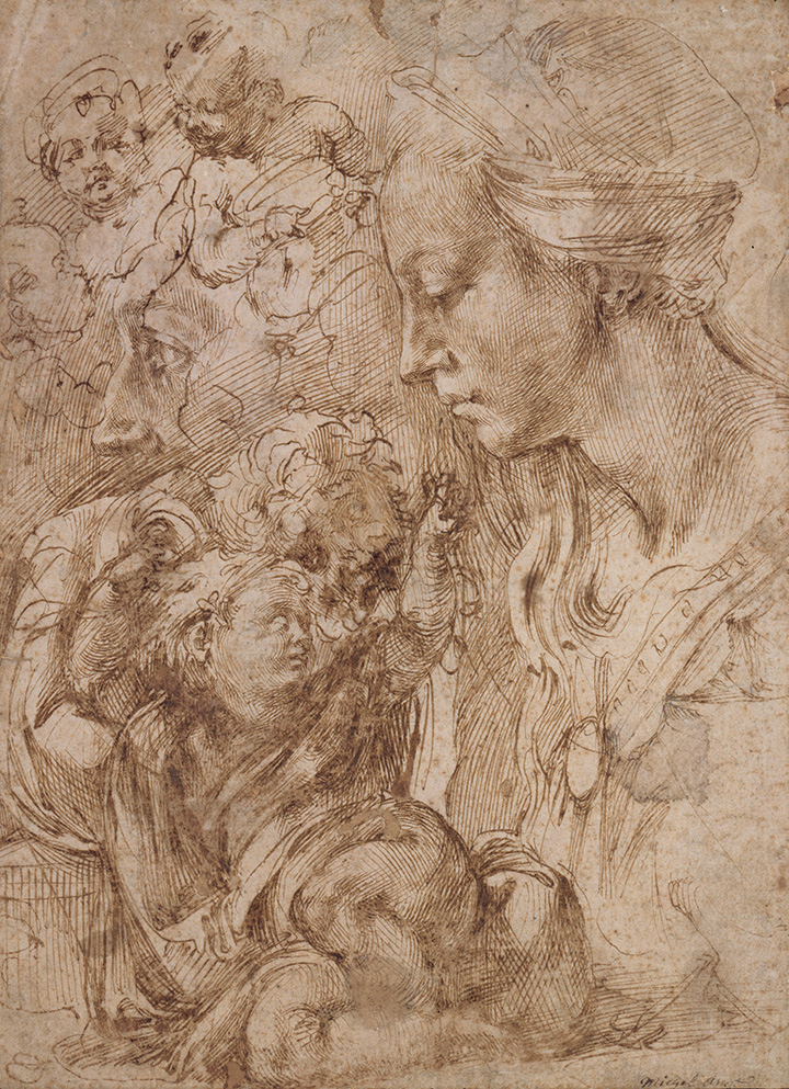
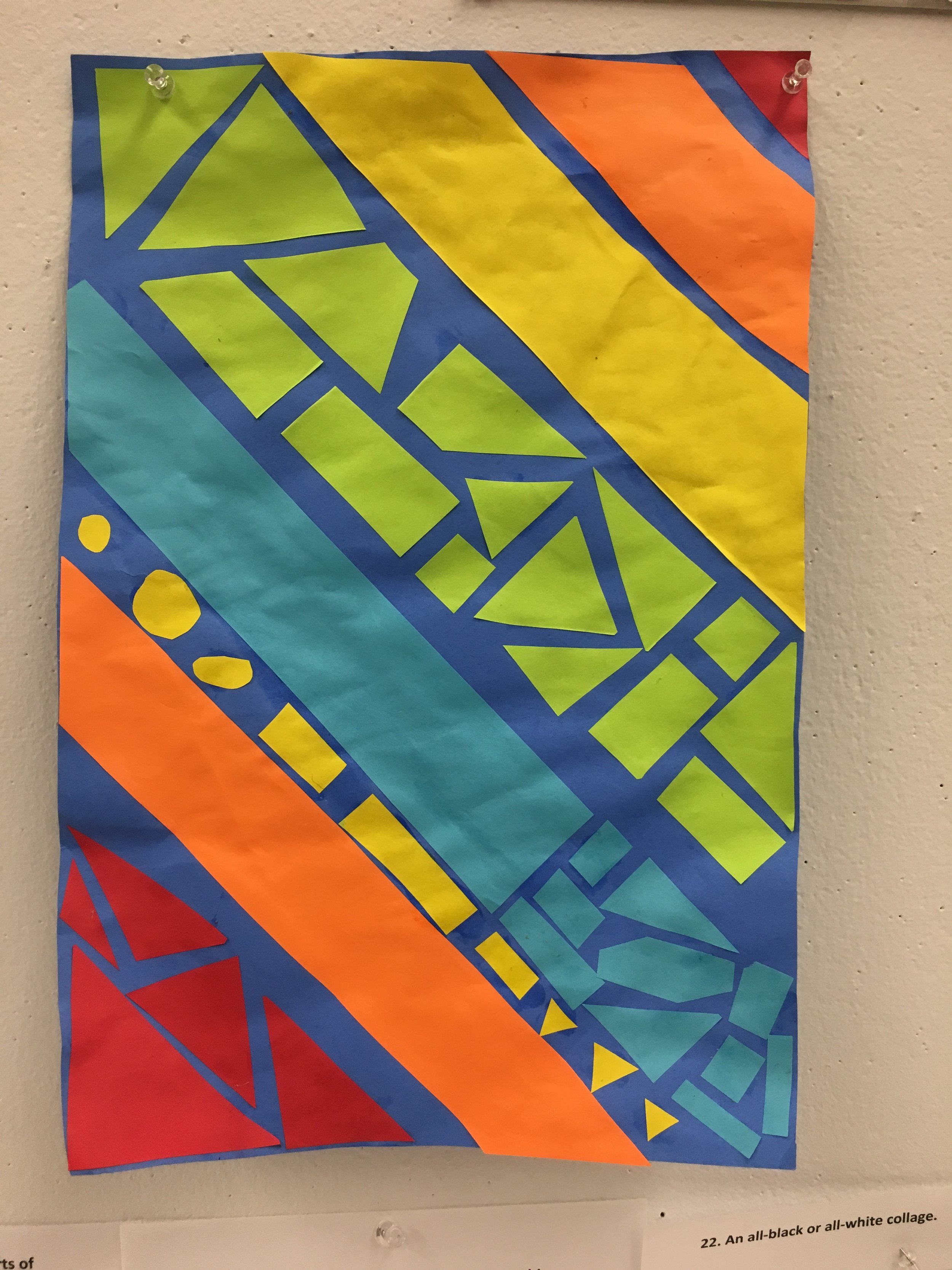
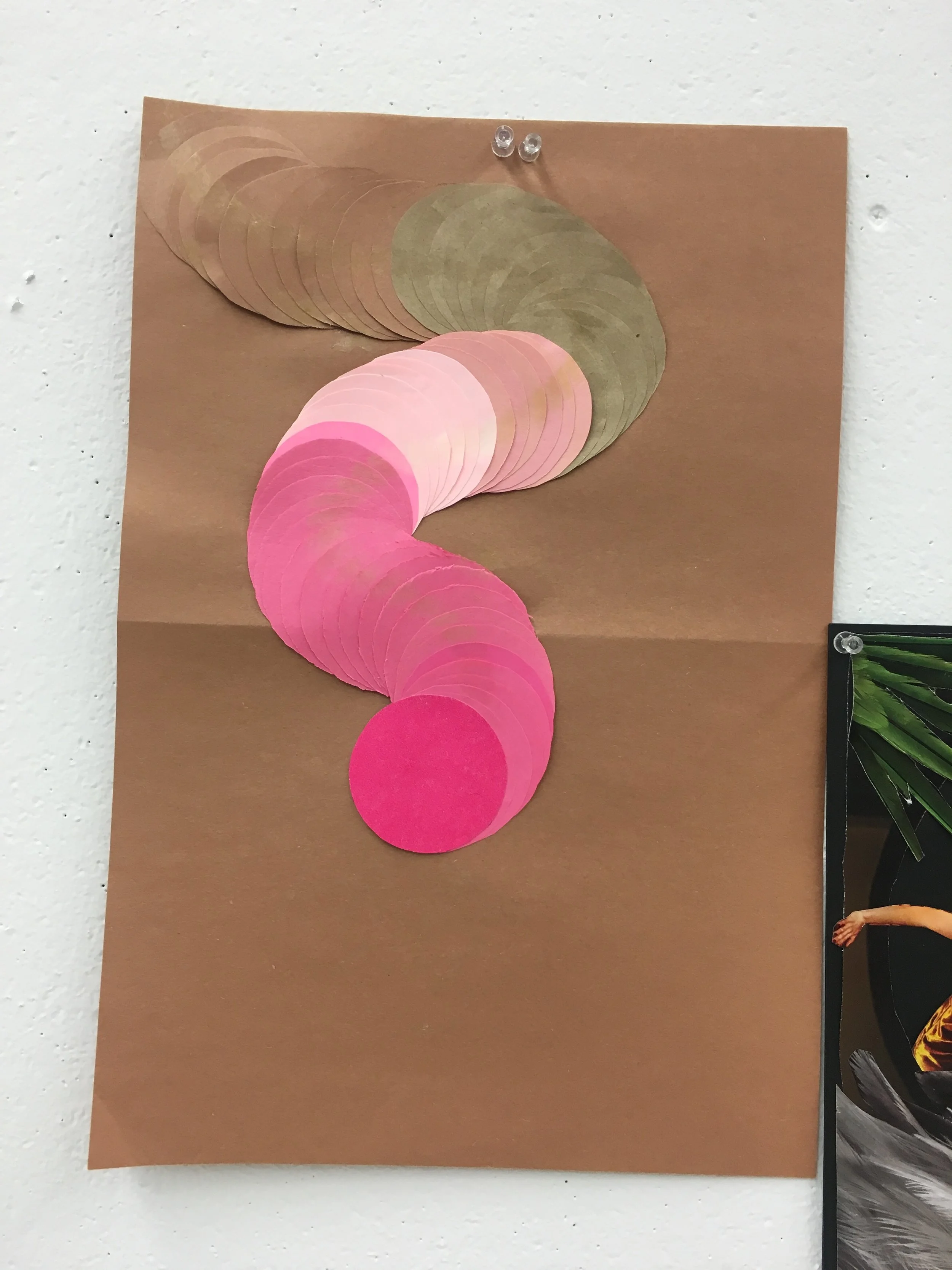
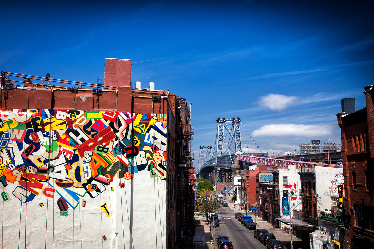
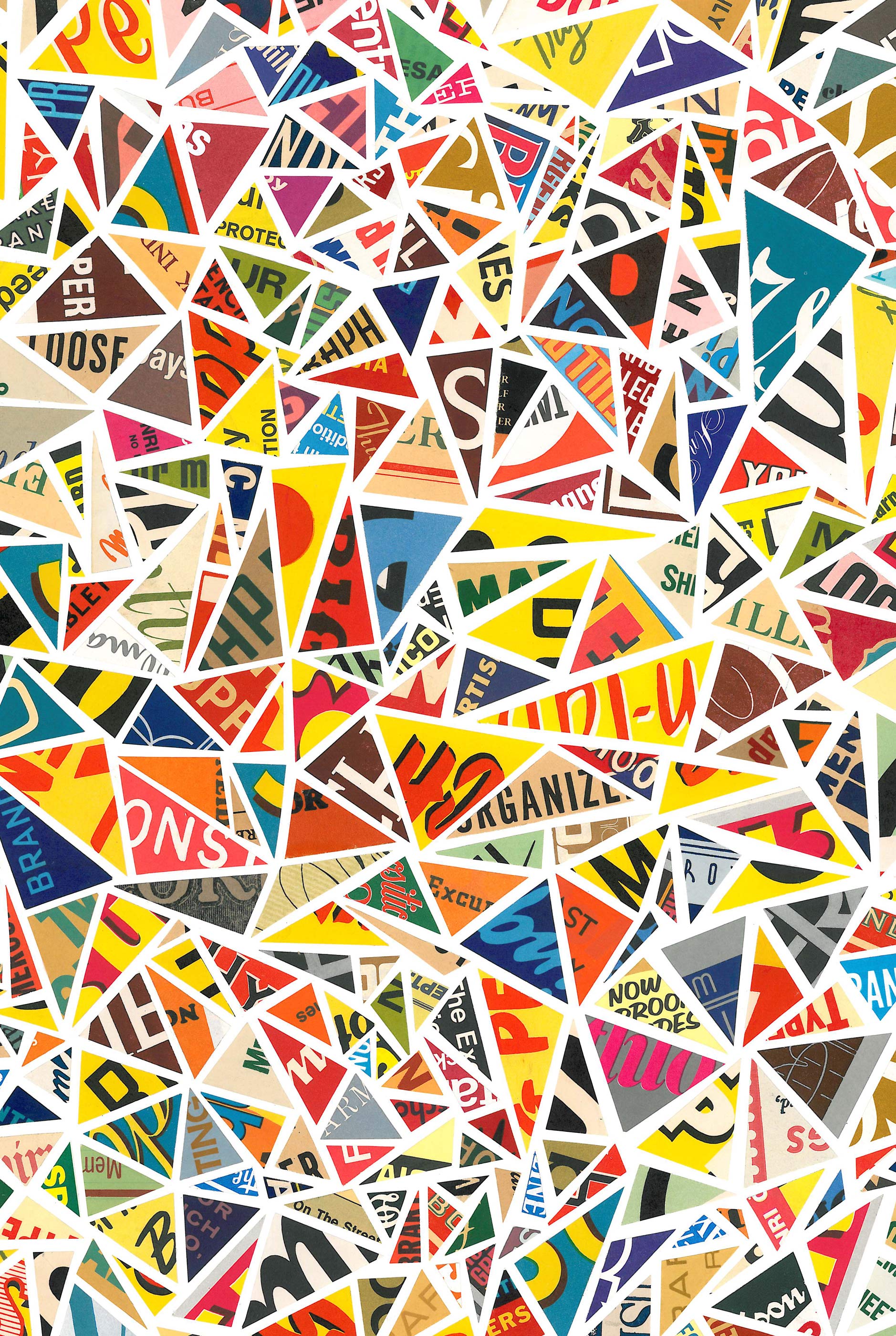
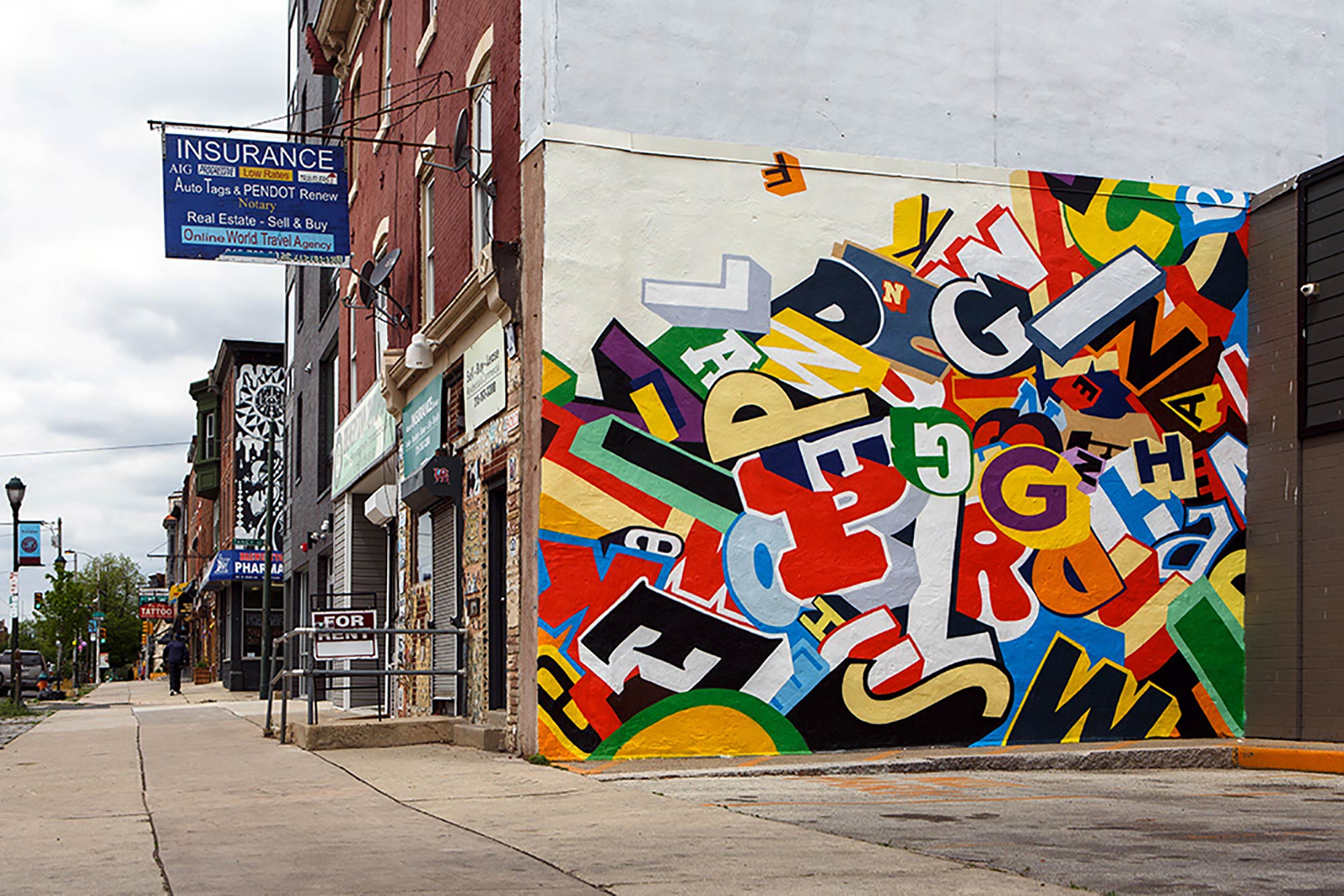
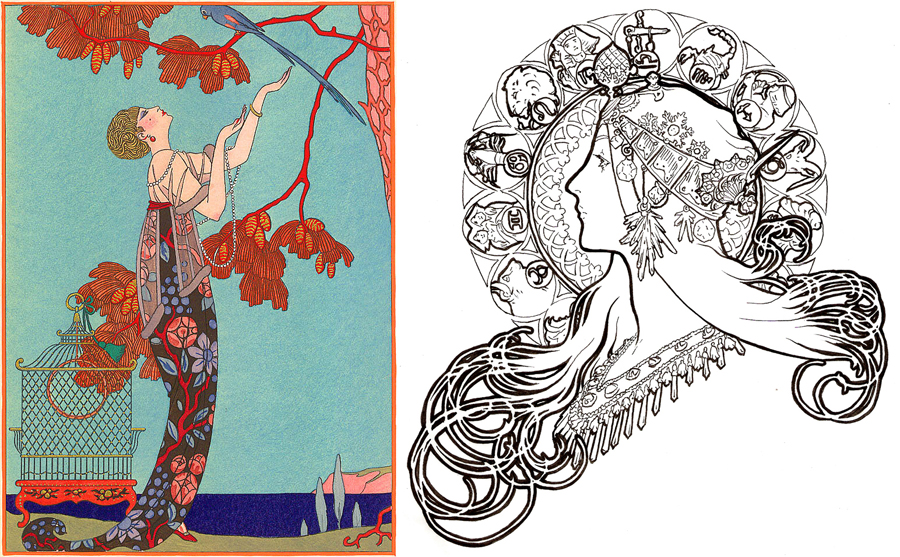
Below are pictures that I grabbed inspiration from:

What made you want to work with the material you selected for your final project? What did you hope to accomplish?

The material that I chose to work with for my final project was printmaking with rubber plates. I hope that this way, I could gain more experience working with the material in a formalized way with a clear project idea in mind. I also wanted to give myself a chance to work with the material longer so that I could add more detail to the design. Through this project, I will also be able to carry out a project/lesson that I hope to further refine for my future students.

How did your ideas change and evolve as you got into the project? What challenges did you come up against that you needed to resolve?

My idea started as a potential future lesson for students in high school. The idea came from a culmination of the projects and classes that I took this semester. From my artistic development class, I learned about STEAM and how the program could be implemented into the art curriculum. The way that this is done is through translation of a subject with multiple materials. This gave me the idea of translating a book into visual symbols. Through exploring materials in my processes and structures class, I found, aside from my personal enjoyment in working in a larger scale, that an artist can work in a large scale regarding multiple small works. This gave me the idea of working with smaller rubber plates and making multiple prints.

When I started working towards a visual subject, based on the book The Beautiful and Damned, I found that Art Deco would be a great visual subject for my prints. Not only is it recognizable, but it is very relevant to the book's themes. What I did not expect was how much time and work I would have to put into doing it because of how long it took to recreate the patterns that I found and came up with. I found it difficult to be so patient with a material. I also found that working with small rubber plates was difficult because they are so fragile. The tool that is used to cut the plate is much sharper than the hardness of the material, therefore it was difficult to be so precise and not make any unwanted marks. These challenges were overcame by taking more time to be careful when making my marks on the plates.

As I began to print, I found that some of the metallic inks that I wanted to use were of a thicker consistency than the regular ones. This made printing trial and error based. Although it slowed my process down a bit, it was worth it because once I figured out how much ink was needed, then I could make as many prints as I wanted.

Overall, the idea that I had for my project did not change much. The challenging part of the project was going through the process of printing and figuring out what worked and what didn't. This took time, but I will assure my future students that it is worth it and if they are personally motivated in the project, than this will not be a big issue.

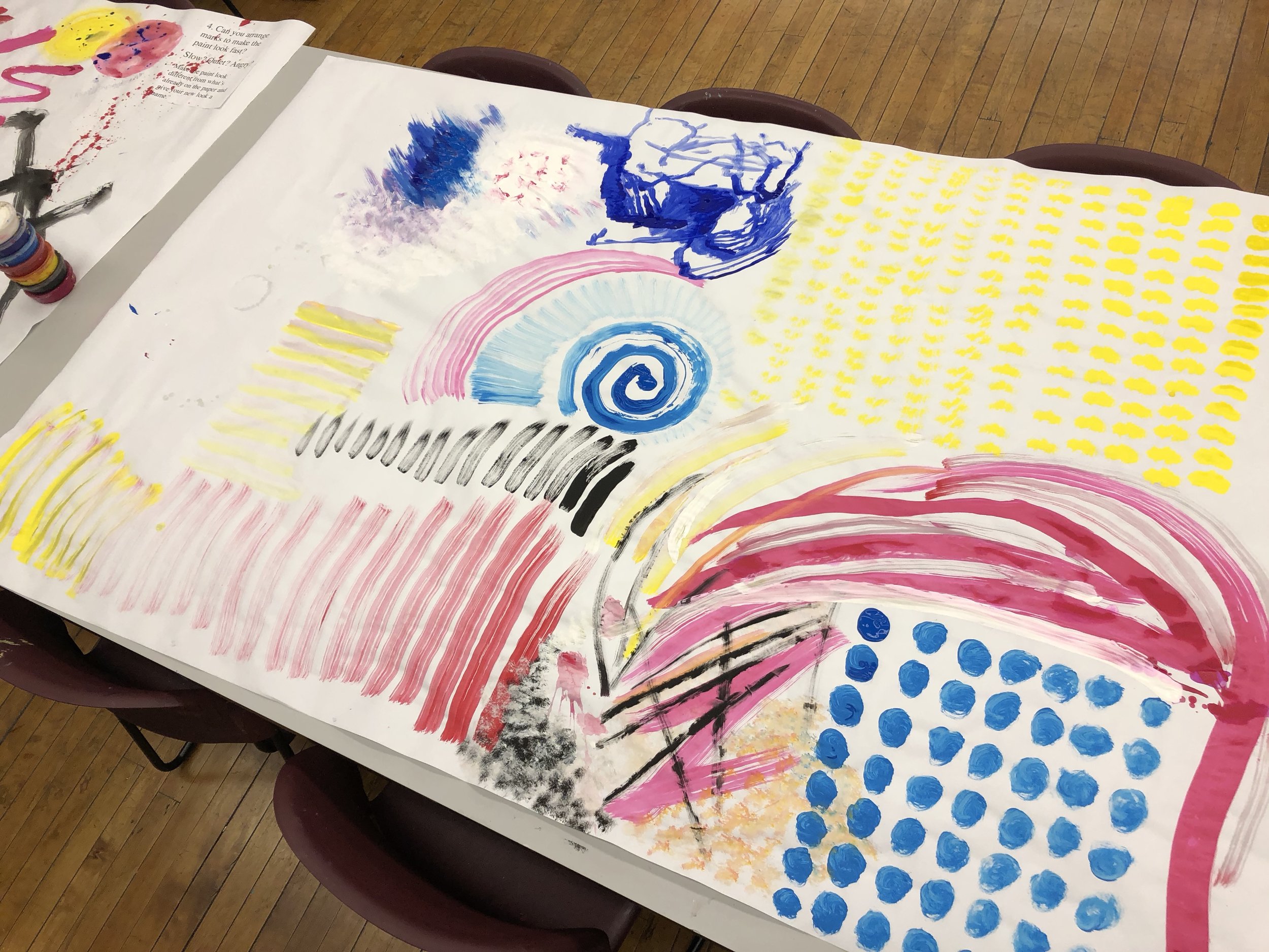
How did you experiment and PLAY with materials and ideas in your piece? What did elements of PLAY result in?

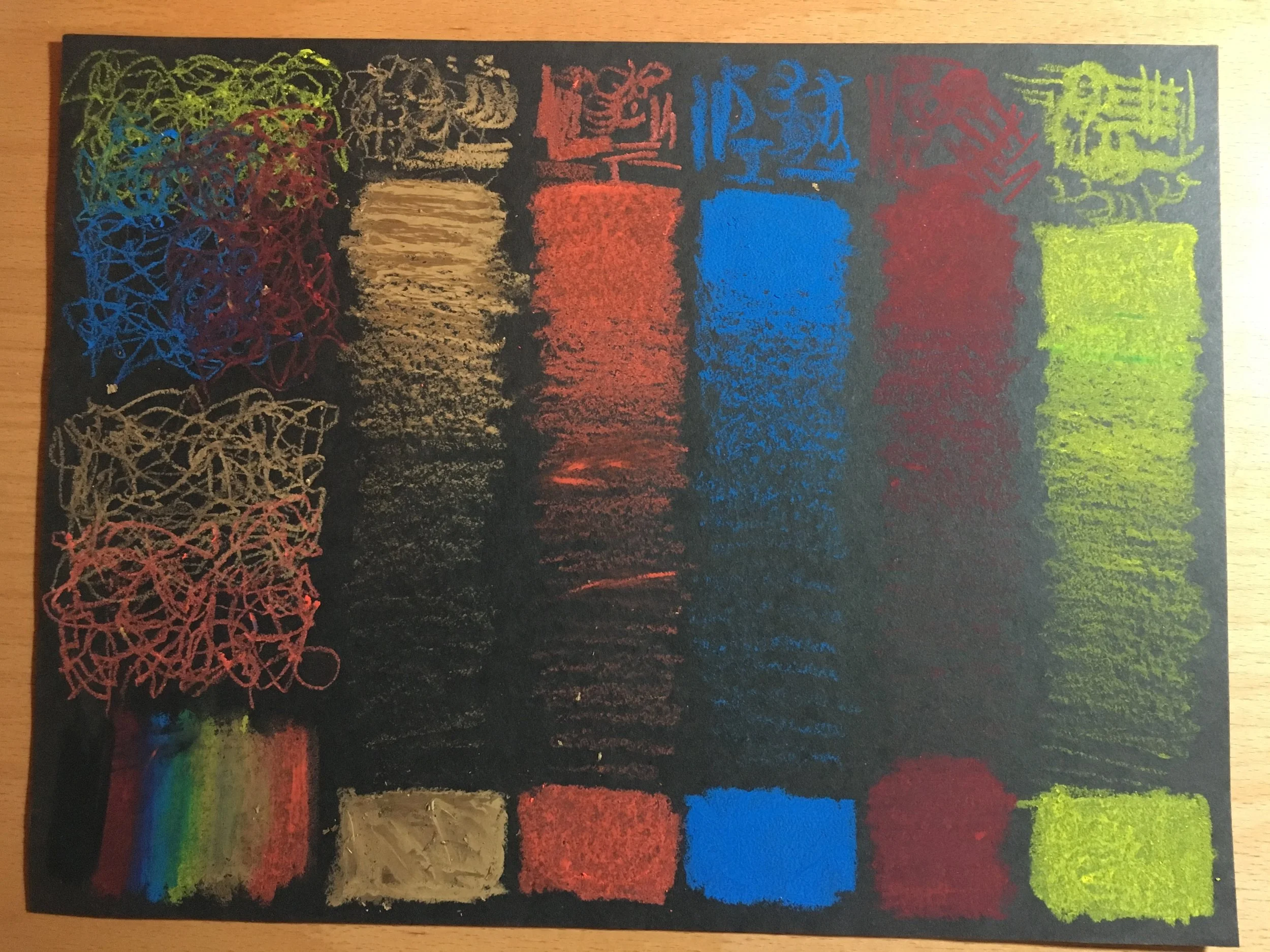
I experimented and played with the materials by using many of the materials I have at my disposal at home, outside of the Macy studio. I have my own brayer and tools to cut the rubber plates. Before leaving class, I was also able to bring paper home that is mostly made of plastic, which prevents bleeding of water based materials. This was fun because I was able to play/experiment/explore what kinds of effects that I could use with the plates on this new kind of surface. Playing with the material resulted in me finding out that since the surface has some transparency to it that the metallic ink looks bright and somewhat luminous when the surface lays on a white background.

What works particularly well about your finished piece? What are you excited about with regards to the way it turned out?

I think that what works well is how the ink looks when layered on top of a white surface. I am definitely excited about it because it proves that playing with material results in things that you may not have expected, and could create something better than you envisioned.

What things might you do differently if you were to try this again?

If I were to do this differently, I would try to do it with a larger and firmer plate. I believe that this will allow me to work in more detail, because I will have more space to do so, and it would allow for smaller mistakes because the material would not be as 'weak.'

What does this piece lead you to want to do next? Why?

This piece leads me to want to implement it as a lesson in my own classroom one day. I think that it could get students to explore printmaking and practice translating conceptual ideas to visual motifs. I think that students will enjoy the opportunity to explore printmaking within their own interests, and play with printing on/with various materials, which would eliminate pressure for the prints to be 'perfect.' While the project is open-ended and choice based in how a student could approach it, it also is able to focus students ideas to practice their techniques in printmaking.

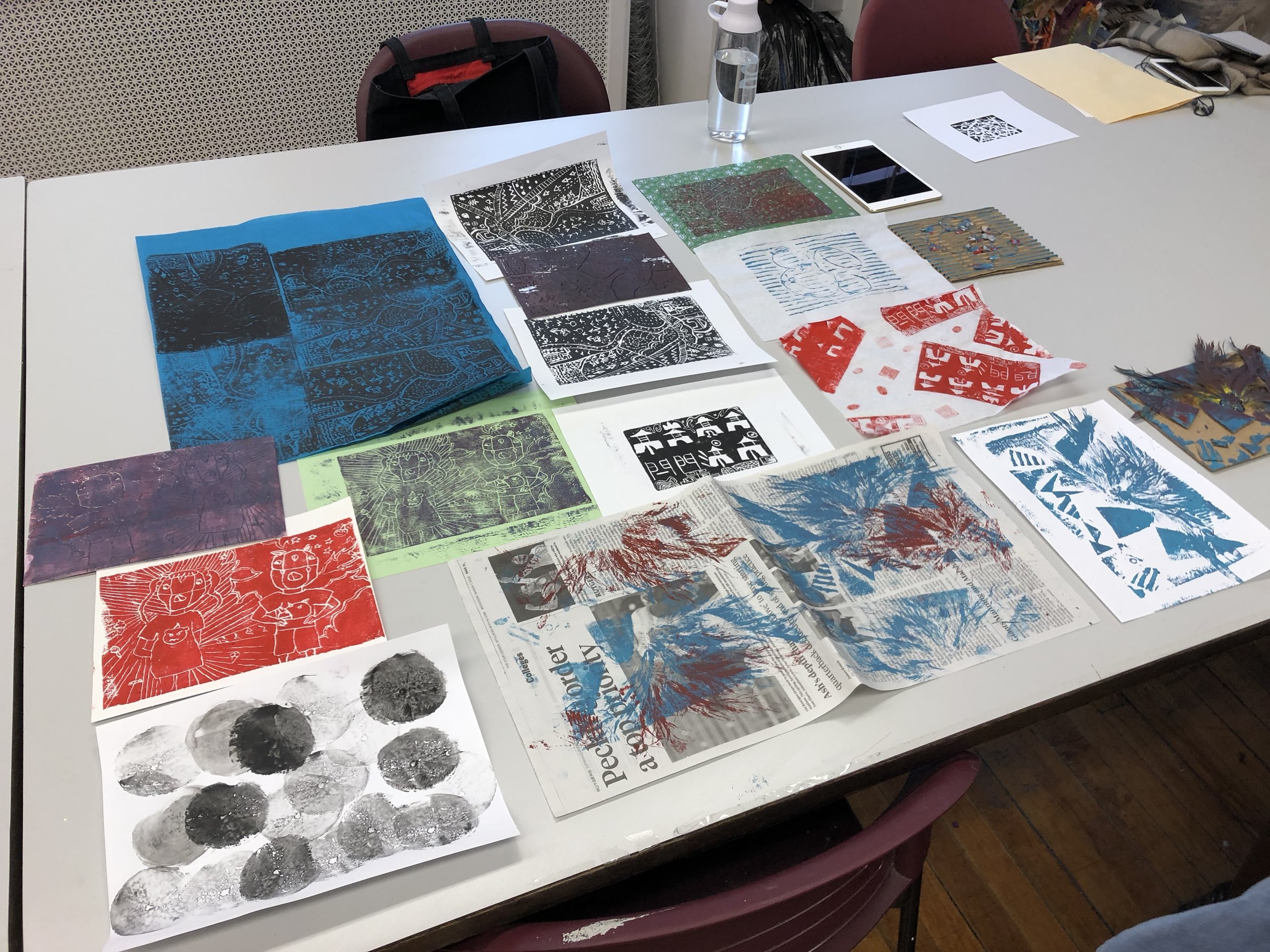
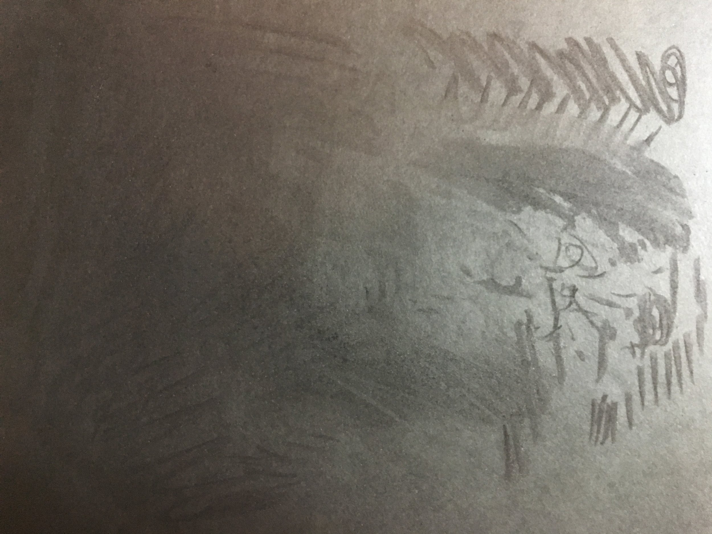
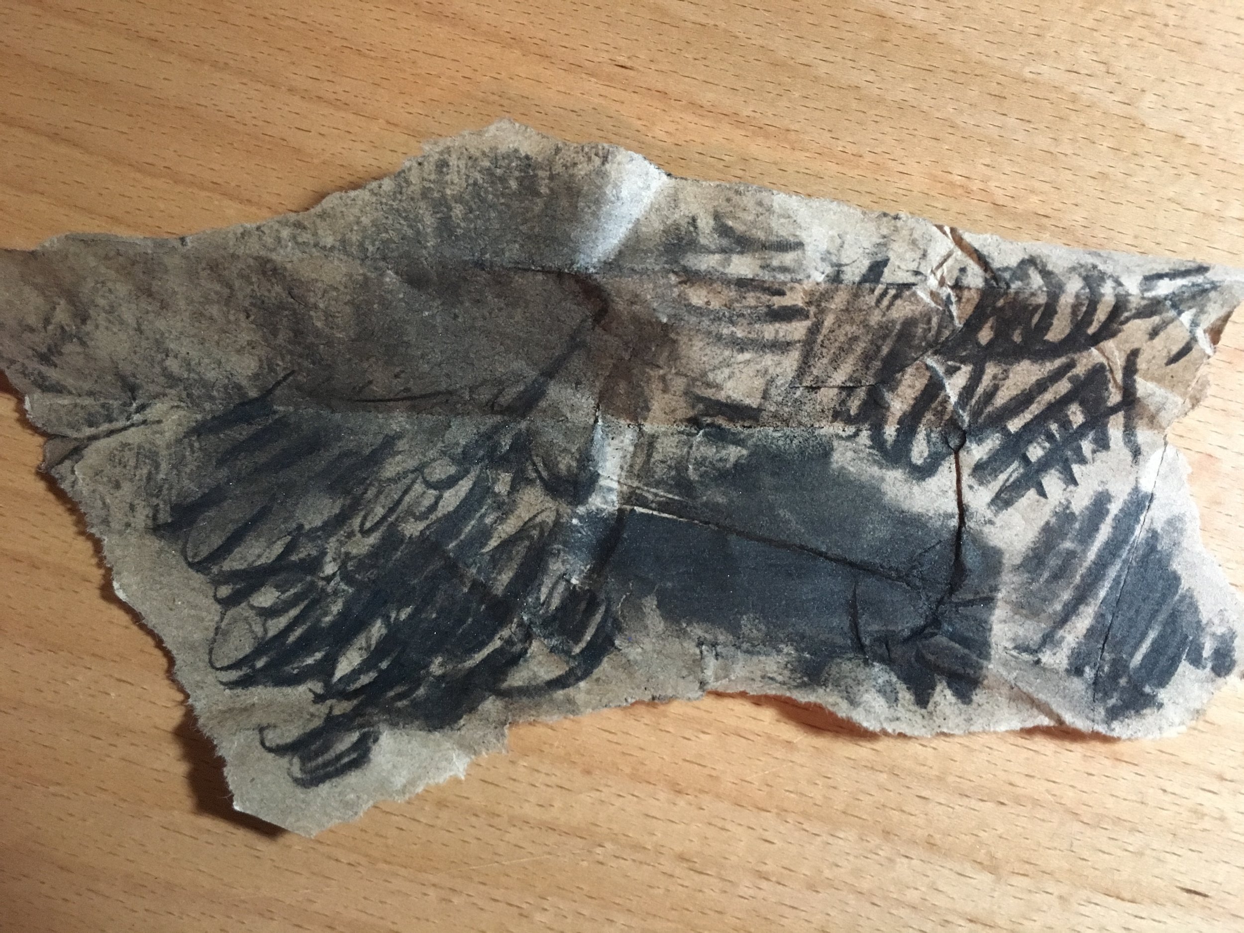
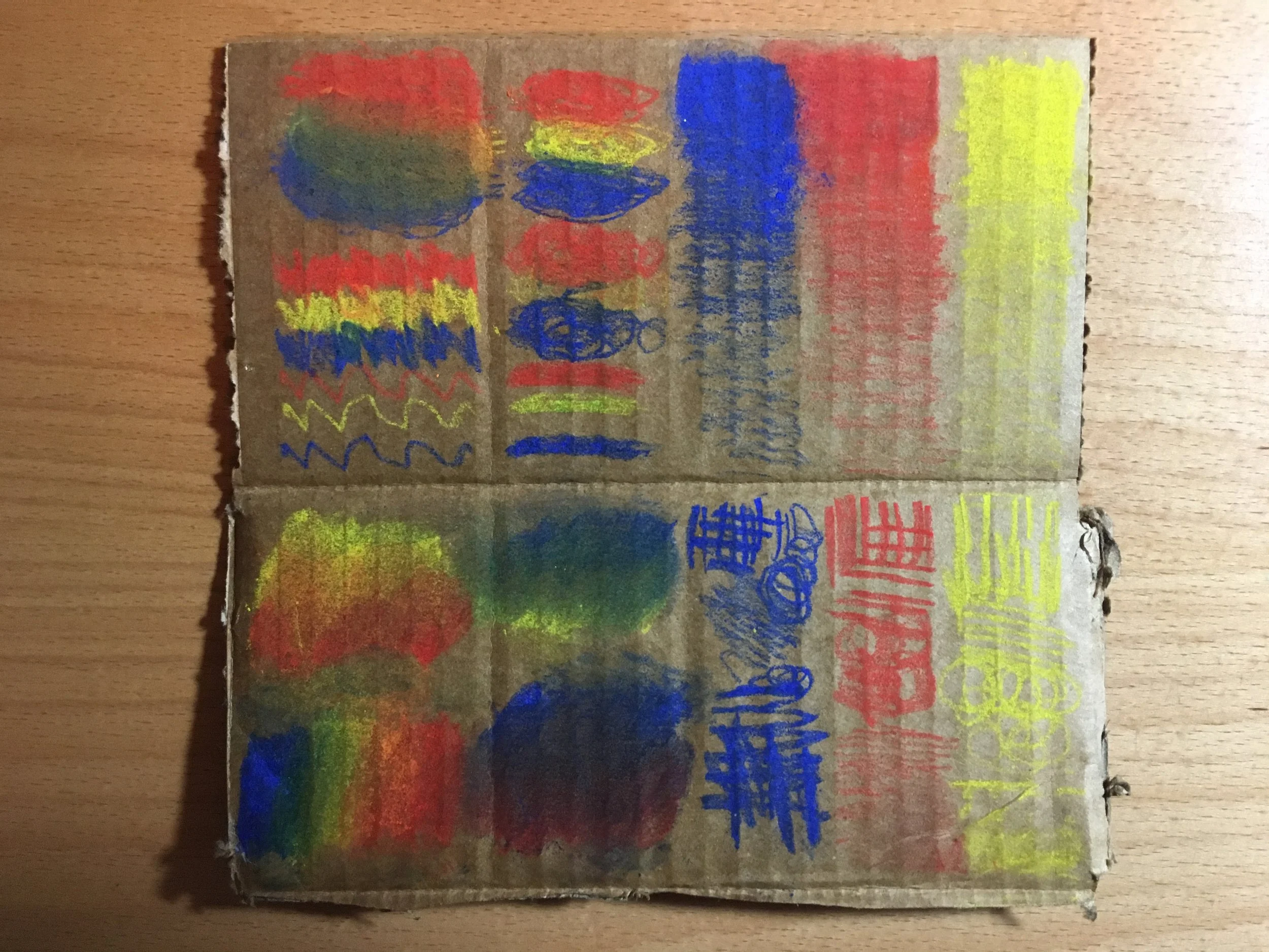
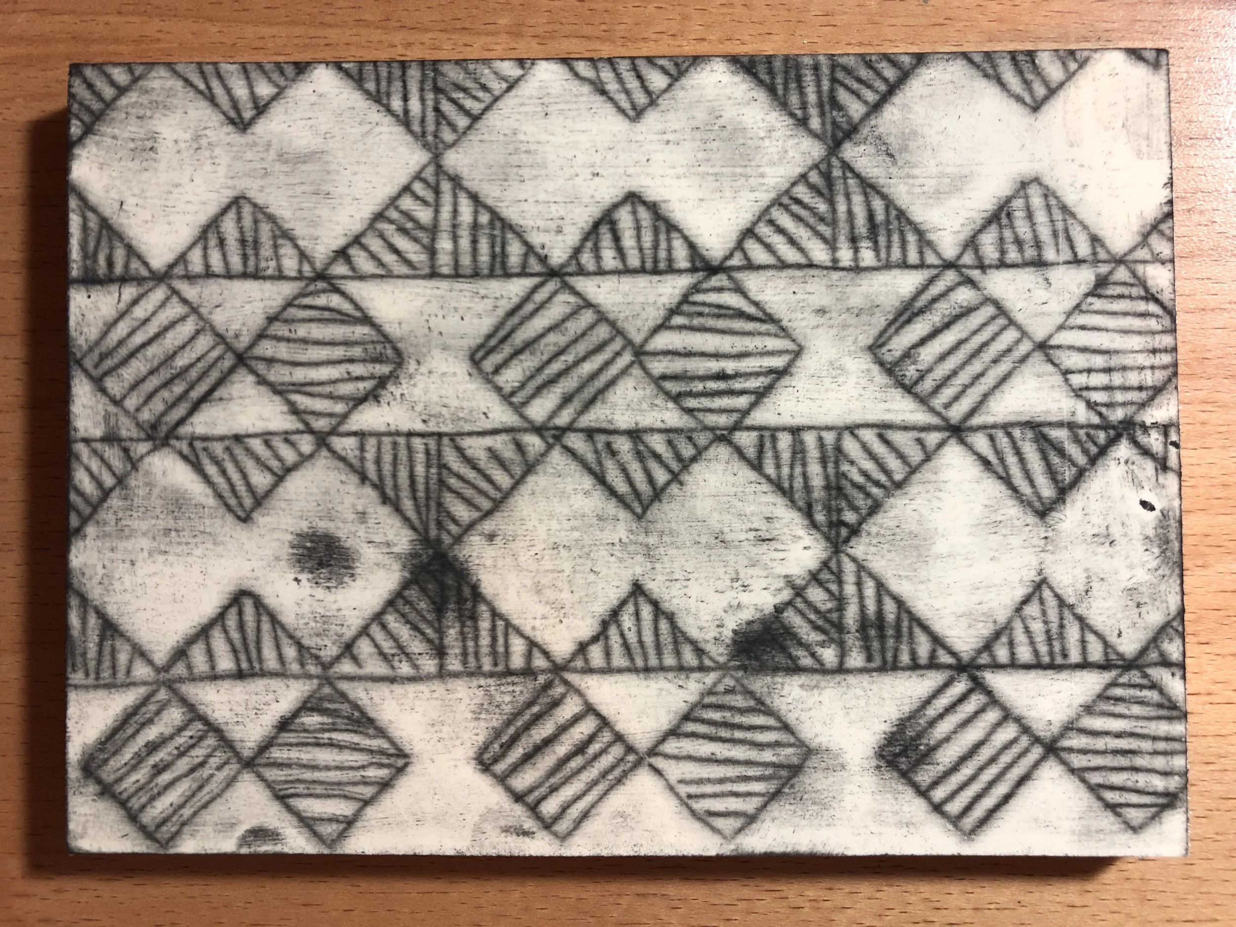
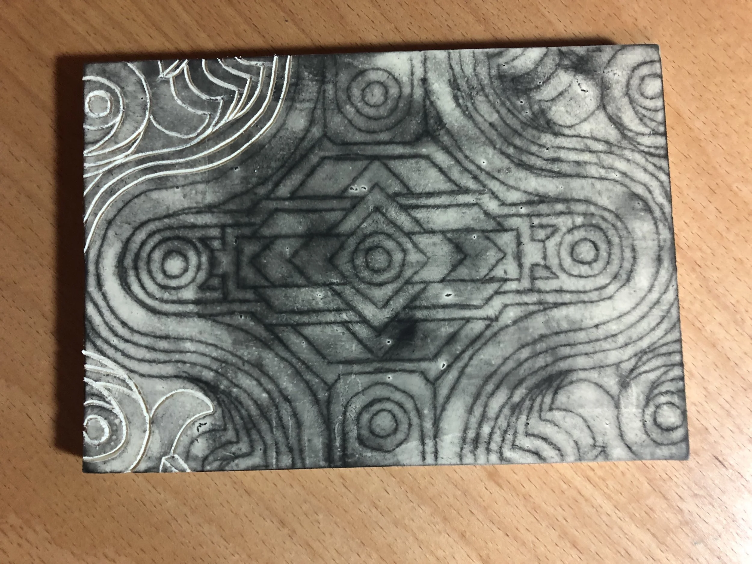
Below are pictures of my plate preparation process:

Below are pictures of my printing process:

There are the best prints I chose to use for my final project.

There are the best prints I chose to use for my final project.

I found that being able to have many options to choose from was best in my final project process. It was also important to consider how the artwork was going to be displayed/presented. I thought it best to have them flush to a white background to se…

I found that being able to have many options to choose from was best in my final project process. It was also important to consider how the artwork was going to be displayed/presented. I thought it best to have them flush to a white background to see the details in the prints better.

Miriam Schapiro by Annie Silverman

My Notes About the Exhibition:

The exhibition, Surface/Depth: The Decorative After Miriam Schapiro was featured at the Museum of Arts and Design. The exhibition was called "Surface/Depth" because of how Miriam Schapiro was able to use "surface" materials to describe deeper themes in her work. It was also named this because of how Miriam Schapiro inspired so many other artists part of the exhibition. 

Miriam Schapiro was a trained abstract expressionist painter in New York City during the 1970's. Most of her work during this time was in acrylic and featured a lot of geometric shapes being represented in space. She eventually moved to California and became a teacher, where she noticed that women were not treated with the same respect that she was treated with in New York. Because of this, she started her journey as an educator, artist, and activist. 

The art that she created as an activist was by using materials that were considered "decorative." The materials that she used were considered "crafts" and she also used domestic items as materials that you would find around a home or kitchen. She reappropriated  these materials because she found artistic value in them, and also wanted to make the "womanly domestic" items into beautiful art. These materials showcased her talent for using various materials, and also highlighted femininity. The materials that she used, collage feminine related items, were put together to create, femmage. While working in this medium, she also created a manifesto, which described various subjects in women's rights.

The majority Schapiro's work featured in the show is 2-dimensional. Because of her background in abstract expressionism, I noticed that many of her work displayed referenced the kinds of geometric shapes used in her other work. In her work called, Flying Carpet, she creates a black frame around her work and collages' over it to look like the designs/patterns are going beyond the frame that she created. She also used a lot of loud colors in her work. Besides collage and paint, she also used spray paint in some of her work like, Voyage. There was also work that she created inspired by Asian art. In the works Orange Crush and Vestiture Series, she uses motifs from feminine Asian culture. In particular, Orange Crush, features an orange fan. She was so inspired by the culture that she wanted to use an object that represents femininity in Asian culture.

The material that Schapiro uses in her work advocates for women because she uses items that were "made for women" in society as art. She shows the world that not only do the materials have a place in art, but women also have a place in the art world. Schapiro is able to convey her ideas through the subject of her artwork but also because of the kinds of materials that she uses.

What I particularly admire about her work is that she is able to make kitsch materials look elegant. The way that she organizes her work compositionally puts the materials into a new concept that is interpreted as art rather than an object.

Below is a slideshow of some of my favorite work from the show:

My Essay:

The exhibition, Surface/Depth: The Decorative After Miriam Schapiro, is featured at the Museum of Arts and Design and highlights the influence that Miriam Schapiro had in art and women’s rights. Included in this exhibition are works by Schapiro and the many artists that she inspired with her advocacy and unique material usage. Through the materials that Schapiro uses in her artwork, she is able to convey ideals about women’s rights in society and the art world. Studying Miriam Schapiro’s work can expand one’s artistic repertoire regarding how to use materials, and how to represent conceptual ideas through materials characteristics.

Miriam Schapiro was an abstract expressionist painter who lived and worked in New York City during the 1950’s. While there, she worked on paintings that featured a lot of geometric shapes represented in abstract spaces. She did this by knowing how space could be changed by manipulating colored shapes and contour lines. The kind of work that she did in New York influenced the artwork that she completed in California during the 1960’s. While in California, she worked as a teacher and artist. Schapiro eventually became active in the women’s rights movement during the 1970’s. By using her talent, she started a new artistic trend called femmage, which is a combination of the words feminine and collage (wall text). These works were inspired by women’s domestic items and crafts, which she used as materials in her work to convey ideas in women’s rights.

The materials that she used in her femmage’s were considered decorative items that were made for and by women who traditionally stayed home. Such materials were not welcomed as sanctioned supplies in the art world. Many of the items that she used in her work were “…fabric remnants, embroidered handkerchiefs, crocheted doilies, lace, ribbons, buttons, dolls and doll furniture, masks, fans, [and] jewelry…” (wall text). These re-appropriated items were chosen because of their particular feminine characteristics, and also used to consider the limitations that materials have in art. Because of the preconceived uses for the objects she used as materials, she comments on expectations of women in a traditional domestic sense and as artists. By looking at her femmage’s, it is clear that she overlaps found materials and acrylic paint until she is able to create an interesting two-dimensional space. One way that she does this is by juxtaposing cutting and tearing material combined with her knowledge of geometric shapes in painting. Besides materials, Schapiro also references feminine themes by shaping her canvases into symbols that are significant in regarding women in society, such as a house, fan, or heart. Miriam Schapiro has been able to make deliberate choices with materials that shape the concept behind her work.

The work of Miriam Schapiro can be used as an example for students, of all ages, to realize the possibilities there are with any kind of material. During early childhood, students’ artistic development should be focused on building their repertoire of artistic techniques by allowing them to explore the material within their own interests. Material exploration enables children to learn “…basic concepts of how the world of objects works and also their own capacity to be effective in it” (Smith, p. 4). Interacting with materials helps younger children understand the relationship between themselves and how their actions can change their surroundings. Through exploration of materials, children can gain a basic understanding of this concept, thus aiding their artistic development.

The materials that are used in Miriam Schapiro’s work can assist students in younger grades, first through fifth, by growing their artistic repertoire. By introducing students to her work, one can learn how various studio approaches to material can create different visual effects of an artwork. Schapiro’s intention was to show how decorative materials could be considered as professional mediums, which is why she did not alter the overall integrity of the materials. Maintaining the integrity of the materials is exhibited in the work, The Beauty of Summer, because of her ability to combine collage and painting. After analyzing Schapiro’s work, students can be challenged with wondering in which ways they can change their material without the use of tools or adhesives. In this way, students will be able to explore materials just by manipulating their given characteristics. This could be useful for students because they can eventually use their knowledge of influencing materials to express meaning in their own work.

Schapiro’s work shows strength in how she uses materials to create compelling compositions and to communicate complex messages, which is why it would be advantageous to expose students to her artwork. One of the goals of adolescent artistic development is to guide a student’s repertoire of skills to use in positive self-expression. This idea is reinforced in Judith Burton’s writing, she states that “Open-ended challenges [explore] the qualities and properties of materials and their potential uses need to be carried over into activities that require the application of new understandings in re-presentational activity in relation to subject matter and content of interest to youngsters themselves” (Burton, p. 32). In other words, exploring materials give students the skills they need to investigate parts of themselves and other subjects of their interest. Adolescent artistic development is driven by changes and challenges with themselves and their relationship to the world, which makes studying Schapiro’s art advantageous in how they can begin to explore those issues.

Miriam Schapiro has a firm understanding of how materials can influence her viewers, which is why introducing adolescents to her work can help them understand how materials can call forth meaning, and apply that skill to portraying their own concepts in art. By examining her work, House of Summer’s Night, students can analyze how she not only kept the integrity of her materials but used them to communicate themes pertaining to women’s rights. Students can be challenged by using their repertoire of studio approaches to select a material and manipulate it to create their own meaning. By giving students an open-ended assignment to explore their own interests through material, they are encouraged to express themselves in this positive way.

After examination, it is clear that Schapiro made deliberate choices in choosing her materials and subjects to enforce her ideals about women’s rights, which has inspired me to combine materials in artwork to further the concept within my works. What is most interesting about her work is how she is able to make the materials she uses look like an elegant artwork, instead of kitsch decoration as they were originally purposed for. Her work not only advocates for her cause, but also supports the idea that anything can be considered a material. Knowing about Miriam Schapiro’s work can benefit ideals in art about meaning making and types of studio approaches in art.

Paper Mâché by Annie Silverman

Class Notes:

When we began class, we spoke about what paper mâché is and what it's characteristics are. Our teacher first showed us some artists that use paper mâché in their work, as well as student work. Two of the artists that we were introduced to were, Mark Bradford and Red Grooms. Both artists use sculpture and paper in their work.

We also talked about how it is not only describing the material but also the way that the paper is bonded when it is used. If something is made out of paper mâché, the user must start by making an armature for the paper to be laid on top of. The paper that is used to lay on top of the armature has to be matte news paper, otherwise the material will not stick with the adhesive. This will make the product have a matte finish, but a sealant can be applied if the artist wanted to make the sculpture shine.

We learned that people should be cautious when using the material because some students could have an allergic reaction with the paste used to lay the paper down. Another cautionary when using the paste is to not pour it down a drain. Since the material is an adhesive, the paste will clog and ruin the pipes. Below are pictures of the various kinds of paste that could be used in paper mâché. The one that we used for class was the Wheat Paste Powder. When using that kind, you must figure out a good ratio to mix the powder with water to find a good consistency. It is also good to mix the power as much as possible so that there are not as many visible chunks of paste.

The material is also good for students because it can be done with inexpensive materials. Students can use found objects as molds or find cheap materials to decorate the structure with. The process of making the armature, the adhesive, and the news paper strips is a physical and sensory experience that students will enjoy. The exception to this is if a student is hyper sensitive to some materials, in which case, they can wear gloves to make the process less stimulating for them. This process is also good for students because it can be a long one. The students will be able to take their time exploring the material, planning out their sculpture, and making their piece. Even after the piece is made, students can decorate it with other materials. Students can paint their sculpture with base white acrylic paint (gesso), wait for it to dry, then paint with tempra and other details over it. They can also apply yarn or fabric to the outside of the sculpture. This can incorporate various skills for students to practice and activities that some students like over others.

Homework:

Once we learned about the process of paper mâché, we were assigned to make a structure or animal that can touch the surface of a table in three points. I was paired with Courtney to complete the assignment. We combined our ideas of creating an abstract sculpture and recreating the wire-like legs of a figure in a movie. Because of the nature of the material, our project morphed into a structure that we call, "the Lone Survivor." We called it this because it takes the form of a cowboy-alien, and the material is also weighted down in a certain area, which sparked the idea of our figure being a survivor since it stands up. 

Below are pictures of our process and product:

Class Notes:

During the next class, we had time to finish painting our projects. My team decided to paint our figure the colors that we thought the environment would look like where it could reside. Since the piece reminded us of an alien cowboy scene, we decided to paint a scene with rocks and dirt hills with a sparkling night sky. This way, our piece has represented how the material, paper mâché has completely controlled the direction that our subject took. 

Our class also talked about the processes that each group took in their project. It was clear that we each had a different method for approaching the project. The other two groups had ideas going into the project and were, for the most part, able to carry out their vision. One team decided to create a flamingo with an umbrella, another chose to create a lobster. The flamingo group carried out their vision to how they wanted. The other team was influenced by the nature of the material and created two parts, one was a lobster and the other was a lady bug. After making the pieces for the lobster, they had realize that because of the nature of the material, they had two pieces to work with instead of one subject. After this exploration, it is clear that paper mâché is a material that takes some time to explore and understand how it reacts to actions taken to it. I anticipate that many students', when working with this material, subjects will be determined by the nature of the material.

Below are pictures of my classmates processes and completed projects:

Things to Keep in Mind by Annie Silverman

Class Notes About Modifying Lessons:

During class, we spoke about some materials that students would not respond to, or would be over stimulated by the texture of the material. Some students' disability doesn't allow them to interact with a material the way that the lesson calls for, so it should be noted that students cannot always control the way they use material. Because of this, it would be advantageous to think about how a lesson could be modified for some students. One thing to keep in mind is that you want all lessons to be accessible for all students, no matter what their disability is. It is also important to remember this when modifying a lesson, but also not make a student feel like they are being left out from the rest of the class.

It would also be good to think of how a student can be challenged by modifying a lesson. Some students finish earlier/quicker than others, or are further in their artistic development than others. So that students do not feel bored or unchallenged in your classroom, you should always have some other projects handy, or know how to modify their assignment to make it more challenging. 

Class Notes About Showing Examples:

It is hard to resist showing examples when starting a new project, whether it is examples of students past work or of other artists who work in the same material. This is an okay thing to do in class, but the examples should be diverse. The students should not be made to seem like they have to do the project a certain way, in a certain style, or live up to a certain caliber of skill. The examples that are shown to students should be diverse in what culture of origin, when it was created, and what kind of artist (student or professional). This way, students will have a wide variety of work to be inspired by, and not think that they have to start in a certain place in their work.

Printmaking by Annie Silverman

Homework:

Before class, we were instructed to prepare printing plates for our exploration of printmaking during class. The plates that we make should be in response to one of the projects completed during the rest of class. The parameters were to create at least three plates using various materials. We could have chosen from linoleum, rubber, styrofoam, and cardboard for collagraph printmaking.

For my plates, I decided to imitate some of the patterns and textures found in the painting I completed based off of sound. I specifically chose to focus on the section with the sun motif. I wanted to see what it would be like to use all kinds of surfaces for my prints, so I created six different plates for class. All of the plates had some sort of radiating pattern with different thicknesses and lines. Below is a picture of the plates I created.

IMG_8217.JPG

While creating the plates, I made a lot of observations on how the material responded to my actions. The rubber plates, the smaller rectangle with a beige color, were soft and easy to cut into. The linoleum plate, the dark grey colored rectangle, was difficult to cut into. It was difficult because the surface is hard, but it could become easier to cut into if you heated it. The plate could be heated by putting it on a vent or heated by a hair dryer. The styrofoam plate was easy to work with, but it was easy to cut through the material. The best tool to use for making marks on the styrofoam plate is a dull pencil. The cardboard plates can be used for collagraph printmaking, gluing items onto the board to print textures or shapes. I chose to use marbles and puffy paint to create raised surfaces to print with. The corrugated cardboard was used by pushing the raised ridges down to create negative spaces to print.

Below are pictures of my printmaking process:

Class Notes:

After working on making prints, we discussed what we noticed about the process and result. We started by talking about positive outcomes and what kinds of techniques we used to create those effects. I mentioned that during my process, I used the brayer to make faded patterns. When rolling the brayer over some of my designs, there were marks left over on the brayer, so I used them to create larger rolls of paint on my prints. As shown on the black tissue paper, there are transparent yellow streaks made by the brayer over the lines made by one of my plates. It was also mentioned that people used different plate positions to create various designs and overlapped areas. There were also a lot of prints with multiple colors, some blended and some overlapped. Some of the overlapped colors were also done with registration to create an image. Printmaking is also a good medium for students because you have the ability to create multiple pieces and plates could be done with inexpensive materials.

Below are pictures of my class's final prints:

Painting by Annie Silverman

Class Notes:

During class, we discussed the best ways to teach painting in the classroom. Before students are assigned a painting project, it is good to keep in mind that all students will be in different phases of their artistic development so they must do painting explorations that will add the same basic skills to their repertoire. We did some of these explorations during class, which are pictured below.

We also discussed how, as teachers, we could organize materials for painting. First, we discusses how these materials can be organized. In this case, we used tempera paint for our exploration. These paints, in particular, can be organized in plastic or simple containers like the ones pictured. It should also be mentioned that tempera paint is considered the "gateway" paint to other painting mediums. It is because of it's easy to use, non toxic, and water based qualities. While the material is thick looking, it is easy to manipulate with a brush. Tempera paint also dries quickly which is also helpful when working in a small period of time so students can go back into their work the next day. It is helpful to have these main colors in your classroom: white, yellow, blue, red, teal, pink/magenta, and black. Although, I would personally advise students to stay away from black because it "sucks the color" out of other colors. I would also make students aware of the "dulling" quality that white has on other colors when mixing. 

Second, we discussed what kinds of brushes to have at our disposal. It was recommended to us that we use natural bristles. There are two types of bristles (sometimes called filaments), natural and synthetic. Natural bristles are made from some sort of animal hair, such as hog or badger. Synthetic bristles are often made from nylon, polyester, or a combination of both. Using natural bristles in the classroom is helpful because it is easier to lay down paint on a surface and adds more dimension to the brush strokes. It is also helpful to have multiple sizes of brushes and lengths of brushes. The kinds of brushes you should have are: two flat brushes (.5 inch and 1 inch), one round brush, and two flat generic brushes you can find in any store (1 inch and 1.5 inches).

Lastly, we talked about the supplemental tools that students will need for painting such as something to clean their brush and a container for water (unless you are using oil paints, in which case a container for terpenoid). A useful tool that could be used to clean brushes is a sponge. To save money and resources, you can cut the sponge in half. Some teachers also use paper towels or rags to clean brushes. All of these items can be contained in one tray. As an art teacher, it is useful to become friends with custodians and people who work in the cafeteria, since they can help you manage your classroom. You can find trays to organize your materials if there are old ones in the cafeteria that aren't being used.

IMG_9659.JPG

In addition to the materials listed above, we also had the chance to use palm sized brushes. These brushes offer more control and are also helpful for students with disabilities who have trouble painting. We also used a brand of water color, in a liquid form to experiment with it compared to the tempera paint.

Below are pictures of my class's material exploration of tempera paint with the prompt question:

Class Notes:

After the painting explorations dried, we revisited them to speak about the process we went through when we used the material. We talked about the kinds of tones and messages that are created when certain marks are made. In Exploration 1, there was a distinction between the marks that were made to look softer and calming versus deliberate and fast. It was also noted that there is a difference between the kinds of colors that were used. Some colors pushed forward while others looked like they retreated. In Exploration 5, we discussed which colors go well together, contrast each other, and look on certain color bases. 

Revisiting the explorations helped us in our next painting activity. We applied our new knowledge of painting techniques and applied it to painting music. We discovered that elements in music can be translated visually with different kinds of strokes, contrast, and color. There are many artists that have done this kind of exercise like, Kandinsky. The class listened to a number of songs from different genres, mostly instrumental, and painted what we heard.

Below are pictures of the music inspired paintings that my class completed for homework:

Although this music video is not exactly the painting exercise that we did in class, I think that it is a good example of merging the two artistic disciplines in modern entertainment.

Moderating Critiques by Annie Silverman

Class Notes:

During class, we spoke and practiced different ways to speak and critique art in the classroom. We went over different methods and formulas for students to learn, and how, as teachers, we can further facilitate the discussion. It is important to note that no matter what kind of method is used, the teacher sets the tone of the discussion. If a teacher is not completely involved and present, students will pick up on that attitude and follow by example. Ultimately, the goal of a teacher moderating critique's is to spark a student centered conversation.

Critique Methods: 

The following methods are slightly different, but achieve the same goal. Students should be observing, asking questions, analyzing, interpreting, and communicating thoughts. The purpose of critiques are for students to practice critical observation and critical thinking.

  • PQP (Praise, Question, Polish)

    • Say something good

    • Ask a question

    • Make suggestions

  • VTS (Visual Thinking Strategies)

    • Look closely

    • Talk about what they see

    • Provide evidence for their statements

      • Ask why the student is thinking what they are thinking

    • Listen to their peers

    • Explore different perspectives and understandings

The difference between age groups: 

There is a clear difference in age, experience, material exploration, technique, and skill between elementary school, middle school, and high school. It is important to know that these will influence the kinds of themes discussed during a critique and change the level of appropriate topics to be shared in class. As a teacher, you should be aware of where your students are in their work. Meaning, their skill level and common themes in their work. This will help determine how to appropriately moderate a discussion. Furthermore, a teacher should know their students well enough to understand what they are able to handle. As you get to know your students, you should know their level of capability in terms of speaking about materials, methods, techniques, skills, and themes. 

Working with more advanced students:

When working with advanced students who have experience critiquing, it is easy for a critique to become repetitive and receive shallow responses from students. To avoid this and make a critique more interesting, you could encourage them to look through a specific lenses when analyzing a piece. For example, you could ask them if they could analyze a piece from the perspective of a certain person or in terms of a topic such as feminism.

Critiques with large classes:

In large classes, it could be difficult to facilitate a meaningful discussion because of a multitude of ideas or nerves to speak up in class. A strategy to avoid these issues is by breaking up the class into smaller groups to critique their groups pieces, and then sharing their inferences with the rest of the class. By doing this, a teacher has the opportunity to speak with more students individually and facilitate a more meaningful discussion.

Prompt vs. no prompt

During the critique, I noticed that there was a clear difference between the comments that work of a particular subject received, compared to the work that was more abstract/up for interpretation. Because of the varied responses, your moderation techniques must also change. When working with pieces that are created directly from a prompt, it is good to start with assessing if the student did what was required of the prompt. After that has been established, then it is more appropriate to move onto other aspects of the piece. With a piece that is not connected to a prompt, or more conceptual, center the conversation about learning more about the piece and it's specific qualities. 

Drawing by Annie Silverman

Journal Writing:

IMG_7911.JPG

Characteristics of Graphite

Material Exploration...

Visual Qualities:

  • Grey

  • Metallic

  • Densities of marks depend on hardness of the graphite

    • Hard=lighter

    • Soft=darker

  • Looking closely, you can see small particles

  • Looking closely, you can see small ridges and bumps in the block of graphite

  • Hard marks create small graphite dust particles

  • Reflects light

Sound:

  • Rustic

  • Hard to smell in small quantities

  • Little to no smell in a large space with other smells

Touch:

  • Smooth

  • Easily manipulated with a hard object/tool, soft material

  • Lead rubs off on fingers easily

Sound:

  • Rough/scratch sound when making marks on paper

  • Scratched sounds vary in pitch based on the speed of mark making

  • High hard pitch when dropped/hit on a hard surface

  • Low pitch when hit against a stack of paper

  • Depending on the size of the graphite/pencil, the pitch will change when hit against another piece of graphite

Below are the pictures of my Material Exploration with Graphite:

IMG_9370.JPG

Characteristics of Charcoal

Material Exploration...

Visual Qualities:

  • Color of the charcoal changes based on what kind it is

  • Smooth on long edges of the stick

  • Creates charcoal dust particles when making marks

  • Matte material, it doesn't reflect light

  • Can be made into a compressed stick and pencil charcoal material

    • Compressed charcoal can make larger strokes and thicker marks

    • Charcoal pencils can make thinner and more precise marks

  • White charcoal is easily changed by the other colors of charcoal, the particles will become mixed when touching each other in their original form and in marks on a surface

Smell:

  • Particles can make you sneeze

  • Could have a dusty/rustic sort of smell in larger quantities or in large sections in mark making

Touch:

  • Smooth

  • Residue is easily rubbed off on fingers

  • Compressed stick charcoal is easily breakable

  • The marks made on paper are easily manipulated by rubbing with your finger

Sound:

  • Rough when making marks

  • Hollow sound when hit on hard surfaces

  • Pressing too hard when making marks can make a squeaking noise

Below are the pictures of my Material Exploration with Black and WHite Charcoal:

IMG_6490.JPG

Characteristics of Red Charcoal

Material Exploration...

Visual Qualities:

  • Color of the charcoal changes based on what shade of red it is

  • Smooth on long edges of the stick

  • Creates charcoal dust particles when making marks

  • Can be made into a compressed stick and pencil charcoal material

    • Compressed charcoal can make larger strokes and thicker marks

    • Charcoal pencils can make thinner and more precise marks

  • The different colors of red charcoal go well together when making light tones, mid tones, and shadows

Smell:

  • Particles can make you sneeze

  • Could have a dusty/rustic sort of smell in larger quantities or in large sections in mark making

Touch:

  • Smooth

  • Residue is easily rubbed off on fingers

  • Compressed stick charcoal is easily breakable

  • The marks made on paper are easily manipulated by rubbing with your finger

Sound:

  • Rough when making marks

  • Hollow sound when hit on hard surfaces

  • Pressing too hard when making marks can make a squeaking noise

Below are the pictures of my Material Exploration with Red Charcoal:

IMG_6022.JPG

Characteristics of Vine Charcoal

Material Exploration...

Visual Qualities:

  • Smooth

  • Made of up long pieces of charcoal, not dust particles

  • Shiny/reflective

  • Not completely black when making marks, because of the not as tightly packed charcoal

  • Comes in many sizes

    • Thick and thin cylinders of charcoal

    • Varies in color based on the compactness of the material

    • Line quality and preciseness changes based on the size of the charcoal

Smell:

  • Little to no smell

  • Dust particles make people sneezy

Touch:

  • Soft

  • Very easily breakable, more than the compressed black charcoal

  • Residue is easily left on fingers

    • When marks are being made on a surface, they can easily come off by touching it, blowing on it, or moving the paper

    • Must be sprayed with fixative

Sound:

  • Rough on paper at first

  • Hollow when dropped on a hard surface

  • Dull sound when hit against other pieces of vine charcoal

  • Low scratching sound when shading

Below are the pictures of my Material Exploration with Vine Charcoal:

IMG_0598.JPG

Characteristics of Chalk Pastels

Material Exploration...

Visual Qualities:

  • Multiple colors

  • Can come in a compressed stick form or a pencil form

  • Can see the particles when making marks

  • Similar qualities of compressed black charcoal

  • Does not fill paper well, must make multiple marks over one area to not show the surface behind it

Smell:

  • Little to no smell

  • Wood smell

Touch:

  • Some feel more "plastic" than others

    • Maybe because of how well the material is compressed

  • Smooth

  • Residue is easily rubbed off on hands in the original form and in the marks made on a surface

Sound:

  • Hollow sound when hit on a hard surface

  • Rough sound when making marks

  • Similar qualities to black charcoal

Below are the pictures of my Material Exploration with Chalk Pastels:

IMG_1068.JPG

Characteristics of Oil Pastels

Material Exploration...

Visual Qualities:

  • Comes in many colors

    • The pack of oil pastels that I have include neon and metallic colors

  • Can easily stick to each other, so some of the pastels have other colors on them and can become "grey" based on how old and how many colors it has been around

  • Smooth, unless there are a lot of colors rubbed off on other pieces of oil pastels

SMell:

  • Oily

  • Somewhat plastic

Touch:

  • Oily

    • Looks smooth, but some resistance when running finger across the material in original form and when marks are made on a surface

  • Not exactly smooth mark making, unless pressed hard and making a solid area of color

    • Some pull when making marks because of the oil

Sound:

  • Somewhat louder sound on a hard surface

  • No sound when making multiple marks

    • Oils make no sound/smooth marks on a surface when making back and forth marks

Below are the pictures of my Material Exploration with Oil Pastels:

IMG_7658.JPG

Characteristics of Felt Pens

Material Exploration...

Visual Qualities:

  • Black

  • Comes in various tip sizes and types

    • Round, angled, or brush

  • Has a dry time on certain surfaces that do not absorb the material quickly

Smell:

  • Little to no smell

  • Could depend on how toxic the ink

Touch:

  • Can easily make marks on fingers

    • Can be rubbed onto finders if the marks are not fully dry, it could make a smudge on the surface

Sound:

  • Scratching sound on paper when making marks on an angle

  • Little to no sound when making slow marks on a surface

  • Could make similar "marker" sounds when filling an area

Below are the pictures of my Material Exploration with Felt Pens:

Journal Writing:

In what ways do the different visual effects you're able to achieve communicate different ideas/feelings/states/moods?

The visual effects that I am able to create using these different materials and surfaces can create various tones in my art work. With heavier mark making (depending on the material and color) will make the purpose of the art work much stronger. Lighter mark making could hide or subdue some of the meaning behind the subject of a work of art. The kinds of marks that I am able to achieve can also communicate different tones because it could make a subject look "straight edge" or "twisted" based on how/where on the subject the marks are used. The previous explorations prove that I can change the visual effects of any subject and manipulate it into the tone I want.

Class Notes:

Collaboration

In class, we presented our material explorations and shared what qualities we found in the explorations we completed. We also spoke about how certain techniques are related to certain feelings, states, and moods. After the discussion, we created drawings that go along with the fabric installation from the previous week. For homework, we will be creating more drawings that can be added to the installation.

Below are pictures of our material exploration, fabric installation, and the drawings we did in class: 

Homework:

Below are the pictures that our class made to supplement the fabric sculptures and drawings we made in class:

Class Notes:

After finishing drawings to go along with the fabric sculptures, we moved onto discussing how to teach drawing more effectively in the classroom. We did this by creating three drawings with different materials, different surfaces, and different tones from observation of a stuffed animal. Through doing this, we learned that a good way to get students to observe and exercise their drawing skills was by drawing the simple shapes shown in stuffed animals. The seams shown on the animal can be used as guidelines for a drawing. By utilizing different kinds of drawing material to create various tones, we learned how materials can create visual effects that can represent an object's surface qualities as well as moods.

During class, we displayed our work on a wall along with our stuffed animal. We discussed the differences between the materials we used and how they created different moods across our drawings. We also talked about what kinds of techniques we used to create our drawings. For example, we discussed the differences and similarities between our graphite on paper drawings. In particular, my drawing of the stuff elephant and other contour drawings of stuffed animals. We talked about shading techniques to create a drawing that looks 3-dimensional.

There were also many questions about the best ways to teach drawing in the classroom. First, using a stuffed animal for a subject is useful for students just starting to draw. The basic shapes in a stuffed animal are useful for observation and the subject itself is very intriguing for young students. To engage students even more, it is helpful for them to bring in objects that they are interested in. Secondly, when teaching how to shade it is useful for students to experiment and practice. It would be useful for students to create value scales, which is a system of organizing what a drawing material looks like when different pressures are applied to it (organizing values). There are two kinds of value scales; one is a continuous value scale that has the different pressures blending into each other, and the second is a broken value scale that has different sections to put a particular value. By filling in these value scales a student will have a better understanding of a material and how to use it to get different effects in their drawings. 

Homework:

Below are images of drawings that my class made of their chosen stuffed animals:

Artists Who Work in Drawing:

Liath McGregor

website: http://laithmcgregor.blogspot.com/ instagram: https://www.instagram.com/laithmcgregor/?hl=en

I first encountered the artist Liath McGregor when I was traveling in Australia. His large mural of ballpoint pen and pencil intrigued me, and I wondered how he created so much detail simple drawing materials. Since then, I have followed his artistic career on Instagram, and tried to imitate his skill for detail in drawings. Liath McGregor lives and works between Byron Bay, Australia and Bali, Indonesia. In many of his works, he utilizes portraits and text. Below is a picture of the drawing that inspired me to look into more of his work.

Laith McGregorSomeone2012pen and ink on paper ping pong table411.0 cm x 153.0 cm (table height: 76.0 cm)

Laith McGregor

Someone

2012

pen and ink on paper ping pong table

411.0 cm x 153.0 cm (table height: 76.0 cm)

Michelangelo

Since I started pursuing art as a career I had always been inspired by the Renaissance period in art. I was particularly interested in the work of Michelangelo because of his versatile artistic skill. His sculptures, drawings, sketches, and paintings inspired me to study abroad in Florence, Italy and adopt a Renaissance tone to to my own style of art. What I admire most about his work are the sketches of finished work he left behind. I recently visited the Metropolitan Museum of Art's exhibition that featured Michelangelo and his draftsmanship. The exhibition also included works of his predecessor's and apprentice's so visitors could compare his influences. Below are some pictures of his sketched featured at the exhibition.

Jean-Michel Basquiat

Throughout my artistic development, I have been pushed to build my observational skills to increase the realism aspect of my art. A lot of my work is about showcasing my talent by recreating subjects as exact as I can. But, Basquiat's art has inspired me to look further into my art and create deeper meanings. During my undergraduate career, I encountered his work for the first time and wondered how he became the artist he did. I learned that while growing up, his mother exposed him to many artists and took him to museums to expose him to various forms of art. I believe that this has pushed his artistic development well passed where I was as his age. He was able to look inside himself and gained experiences to eventually express them through art. His ability for self-reflection and analyzing the world around him, has resulted in endless works that make comments on society. 

According to Acquavella Galleries, who hosted an exhibition of Basquiat's work from the Schorr Family Collection, "...Basquiat showed an affinity for drawing at an early age and this practice was a central component of his artistic output. Between 1980-88, the artist produced approximately 1000 works on paper, which articulate complex narratives, revealing flawed power structures and hinting at fundamental failings in social discourse." Like Michelangelo, Basquiat has had experience working in multiple mediums. Besides drawing he worked in paint and printmaking. Basquiat's recognizably unique and distinct artistic style brings attention to concepts by crossing out and repeatedly writing phrases throughout a work of art. His "primitive" style has inspired many to open their minds to the possibilities of art. Below is a work of art that I find particularly inspiring because of the various materials he uses to create powerful moods.

Jean-Michel Basquiat, Untitled (Estrella), 1985Oil paintstick, graphite, and colored pencil on paper, 29 1/2 x 41 5/8 inchesThe Schorr Family Collection

Jean-Michel Basquiat, Untitled (Estrella), 1985

Oil paintstick, graphite, and colored pencil on paper, 29 1/2 x 41 5/8 inches

The Schorr Family Collection

Lesson Example:

Main Objective: To practice working from observation and enhancing their understanding of form by translating a subject from physical, to a drawing (with the medium of their choice), and scanning their image to the computer to apply it to create a digital piece.

In Judy Burton's class, Artistic Development of Adolescents, I have learned about how art is being merged with technology to keep up with today's demand in the graphic arts. This lesson is for students on the middle and high school level and can be altered to students' abilities and experience in material.

To begin, students will have the opportunity to work from a subject that interests them. Depending on the students artistic development, they can work from a simple shaped object or a complex one. Personally, I would have students at the middle school level bring in an object that holds value to them, and I would have high school students choose more complex subjects like a portrait. If a student wants to do a self portrait they can work from a mirror, or if they want to work from another subject they can take their own reference photos and work from them. Once they have chosen their subjects, they can work in either graphite, pen and ink, compressed charcoal, conte crayon, chalk pastel, or oil pastel, even a combination of materials (depending on their material experience). Once they have completed their drawing, they will scan or photograph their work to be altered on the computer. They will utilize their drawing by creatively adding it to another graphic entity, enhancing it with graphic art, or altering their work using graphic tools. By doing this, students are able to think of a subject using various lenses, such as drawing and graphic design. They will also have to utilize their understanding of the principles and elements of design to create a compelling composition. Overall, students will be exercising their talents and adding to their repertoire of skills by working from observation.

Fabric by Annie Silverman

This project started by selecting a piece of fabric in class to deconstruct at home. The exercise was assigned of us to understand the material and explore ways to change/manipulate it.

Journal Writing Before Starting:

What are the qualities of the material?

Varied edges, some what smooth, not easily manipulated with hands so it stays, wrinkled, multiple colors, color is more saturated on one side than the other, heavy thread/thicker, weaving/stitching can be seen, shiny/reflects light well.

What ideas/Associations does it bring to mind? What about it suggests these things?

The fabric pattern reminds me of something from the 80's or 90's. The color and varied strip pattern is a combination I have seen many times in old photos. The material reminds me of a fabric found in an upholstery store as a sample of the patterns that could be put on furniture. The material also reminds me of curtains because of the similar feel.

What deconstructive actions does this invite?

The need to pull apart each thread, because of seeing the stitching and frayed edges. The pattern of different colored strips also invites a long tear in the fabric. It also invites burning because of the surface area and plastic/shiny quality of the fabric. It invites you to mess with the surface area because of the flatness and lack of dynamic texture.

Journal Writing After Finishing:

What kinds of ideas does the piece suggest to you? What qualities of the work contribute to your interpretation?

This piece suggests some kind of tapestry or tattered clothing. The qualities that contribute to this idea are the cuts I put in larger/full pieces of the fabric. The tattered clothing idea comes from the shredding I put in some strips of fabric as well as unravelling the threads of the larger piece of fabric. The pattern of the fabric reminds me of a design on an 80's shirt, which also contributes to the idea of clothing.

Below are a series of pictures of how I deconstructed my fabric and my classes:

Next, we were split up into groups to create a collaborative fabric deconstruction piece. I was paired with Sheldon and Megan. We chose our main fabric to gain inspiration from, then chose supporting materials to aid in our sculpture.

Journal Writing choosing a textile:

Make a list of actions that might relate in some way to the "given" of the item:

To knot, to fold, to burn, to shred, to twist, to fray, to weave, to tear, and to cut.

Why did you select this particular item?

I selected this item because my group were drawn to colors that were subdued, and I wanted to choose more vivid colors to balance out our composition of colors. The colors that we ended up choosing in our piece were variations of pink, purple, beige, and grey. I think that parts of our personalities were taken into account when we were choosing the textiles, which is why we were all drawn to different shades of the same colors.

What ideas does this textile suggest to you? What makes you say this?

This textile suggests that our final piece could be something that could be ordered chronologically. I say this because the reason why we chose the textiles we did was because they were different but they go together. This made me try to figure out an effective way we could put the textiles in a composition that works well, but also satisfies our individual preferences in color and texture.

What things might you want to do to the item? Why?

With my individual piece, I would want to do some variation of what I accomplished with my initial deconstruction fabric. But, when working with a group, I wanted to figure out a way we could work on a larger scale, so my deconstruction method of fraying/unraveling threads will not work. I will have to go with a larger strips/tearing method.

In what ways will this change the form and give the piece new physical structure?

This will change the form because the method of tearing will make more 2D pieces of fabric. Our piece will be flat, which is why I wanted to find a way to make it more like a sculpture so it would be more interesting to look at as well as challenge ourselves to do something different. I think that the 3D element of our collaboration will have to come from the supplemental objects that we get for the project.

In what ways will new meanings be introduced? What kinds of meanings are possible?

In our project, the meanings will come from how we choose to deconstruct the fabric individually and how we bring them together in the end. Each of us will be deconstructing our pieces of the fabric separately, without knowing/seeing what the others have done to it. We will then compare and swap pictures when we are done with the process. I believe that meaning comes from how we choose to accomplish our individual pieces. I think that our unique styles and personalities will come out in our designs, and putting them together will create a new meaning. It could bring a meaning about togetherness and strength in numbers. It could also bring meanings about diversity and tolerance.

Journal Writing choosing alterations/supplemental items:

How might these new materials and their alterations be used with the textile item?

I chose the yarn color the same way I chose the fabric color, since they are brighter colors than in my partners scheme's. The yarn because it will bring our pieces together. Each of us will be using the yarn in some way in our piece. I chose the lanterns because I wanted to find a way to make our collaborative piece more like a sculpture than a 2D deconstruction piece. With the lanterns, we can manipulate it with the fabric and yarn, they can both be wrapped and woven in the lantern.

Thoughts about deconstruction process: What are you doing to the materials in deconstruction? How are you playing with possibilities? How is it working?

I am thinking about my original deconstruction exploration, and seeing if the same kinds of techniques will work on this fabric. Since the fabric that I chose also has think threads, I will be able to fray the edges. But, there is still an obstacle of how to make our pieces more 3D. I will be able to apply my deconstruction methods to the lantern I am going to work with. I can take off the paper surrounding the lantern, and weave the fabric and yarn through it. Once I took off the surrounding paper, it seemed like the twisted paper armature was too week to be on it's own. I will have to find another way to cover the lantern, which means that I should probably be using a wrapping method and tying knots as well.

Thoughts about reconstruction process: What are you doing to the piece as you reconstruct? How are you playing with different possibilities? How is it working?

Since I have worked out ideas about how to deconstruct the fabric, I have found the best ways to reconstruct it with yarn and the lantern. I have been working with yarn since I was young, and know how to knit. I was able to use a technique called finger knitting to weave the yarn into a rope kind of material. With this, I was able to weave it through the armature of the lantern. I also found that tearing strips of fabric would also work when weaving the lantern. But, I did not want the entire lantern just to be done with weaving so that the lantern would have different textures. I created the different textures by leaving some of the strips and yarn hanging from the lantern. When working, I noticed that the paper around the lanterns was keeping the armature strong. So, I decided to keep half of the paper on the lantern to keep part of its shape. On the other side, I had to problem solve my way to covering it without getting rid of the structure. I knew that I had to wrap the strips of fabric around the lantern and then tie the ends together to keep it in place. When I did this, it added a different and smooth texture as well as the knot making it not completely flat. But, I wanted to break up the space of texture and colors around the lantern evenly, so I took off some of the paper around the lantern so that it could alternate between weaving and wrapping fabric. In the end, the lantern seemed to be structurally stable, even if both sides were not completely the same in shape.

Thoughts about hanging process: What are you doing to the piece? How are you playing with different possibilities? How is it working?

Once we brought back our pieces from home, our first thoughts were to analyze what each of us did to the lantern and fabric to understand how we were going to put them together/hang it. Sheldon was unable to use the lantern, so he created something from inspiration from the lantern. It was hand woven and stitched using the yarn that I chose in the beginning. Megan was able to use the lantern. But when she saw that the lantern was really flimsy without the surrounding paper, she decided to create her own paper with the fabric. She was able to put the fabric on the lantern with a glue/paste and water mixture to paper maché the fabric onto the outside of the lantern. This way, the fabric will conform to the outside of the lantern, and it will keep it's shape. Lastly, I was the only one in my group that changed the fabric according to the obstacles I faced with the lantern. By knowing this, we decided that we should put our respective lanterns in a specific order. I originally though that all of them would look good if they were sequenced up and down/on top of each other. But, Megan closed part of her lantern so a  piece of yarn would not be able to pass through her lantern. We then decided that we should take into account what lanterns' purpose are. They are usually displayed next to each other with a string connecting them. We decided to do the same thing, but hang our pieces in a sequenced order and in different lengths. We were able to find hooks that could fit our pieces and I made a larger finger knitted yarn rope with wire inside of it (to manipulate the shape) to connect them all. This worked for all of our pieces and they were successfully displayed.

Note shifts in direction, challenges, resolutions, surprises, and thoughts about final outcome.

Every move that I made with the material; fabric, yarn, and lantern, I have changed direction in because of each challenge I faced. The resolutions that I found were in response to a problem. When I needed to find a way to weave the lantern, I switched to knitting yarn to become thicker and tearing pieces of the fabric to fit between the lanterns armature. The surprises that I found was that my method of working has made a very "loud" and "dynamic" work of art. The approach that I took was head on and solving problems as they came to me. The natural outcome was for the lantern to look slightly torn up and imperfect. But, because of the characteristics of the fabric and yarn, the pieces stands out in color and texture.

What ideas/state/impression does the finished work suggest to you? What characteristics of the work make you say this?

I think that the finished work suggests different ideals, values, and people coming together. With all three of our approaches and methods, put together, the work looks like they fit together. Not only did we all use three different methods of deconstruction and reconstruction, each piece has a different characteristic to it. Sheldon's has a home made feeling to it, which makes it look inviting and small enough to interact with. I think that it also evokes a homey feeling because of the materials that he used to create the shape. The stitches that he used to put the fabric together look very traditional, in a homey/familiar way. Megan was able to problem solve by using her talents to make a structure. A lot of her work until now has been creating a stronger structure. Lastly, my piece was about changing to the circumstances. I was able to take on challenges head on without completely changing initial ideas. Together, we were able to create a piece that embodies all of us as people, artists, and educators.

In what ways are you satisfied with the outcome? What are the pieces strongest elements? What, if anything, might you change and for what purpose?

I am satisfied with the outcome because we were able to put them all together in a stable manner, but also in a way where people could add to it. Since the piece is so stable on the hanger, the lanterns can hold some more weight on them, which allows others to add onto the structure that we created. The pieces strongest elements are the colors that we used and how well they go together to create a unified composition. If i could change anything, it would be trying to hang the lanterns in a different sequence. I was hoping that the lanterns could be held on top of each other/hanging from each other. I think that it would give the lanterns a different meaning. I think that it would let the viewer to see the lanterns as something other than lanterns. When they are side by side, people consider what they are because that is usually what they look like. Since we were trying to change the fabric as much as possible, I was hoping that we could have made the finished piece more structural rather than realistic.

What might you invite exhibition visitors to add to your piece?

I might leave the same colors that we used in our sculpture near the sculpture, as an invitation to add to the piece. With the same color scheme, I think that people would be more inclined to do so. I also think that I could attach more lantern structures or yarn ropes for people to add onto another entity other than our original pieces.

Below are the pictures of my groups progress and final pieces:

Below are the pictures of my classes and groups final projects:

Collage by Annie Silverman

Class Notes:

Kinds of Collages:

Text based/image based (making out of pre existing pieces), texture based, color based.

Create a completely different subject: sometimes with humor, juxtaposition, another scene, and building with shapes

VTS (Visual thinking strategies):

What is going on in this piece? What do you see that makes you say that? What more can you find?

Artists who work with collage:

Barbara Campbell Thomas: limited color palette, distinct shapes, layers, repeating patterns that are organized compositionally

Janet Jones: layering, subtle color changes, used objects with history, natural discoloration

Sophie Aston: contrasting subjects, classical vs. contemporary images/material, contrast color

Dale Copeland: misty color, not just using 2D material

Sylvia Weir: primary colors, balanced composition, something found in the home

Below are pictures of the steps I took to create my collages:

Journal Writing, Collage 1:

Which of the 20+ prompts did you choose? What attracted you to these?

I chose the 2nd prompt about using collage to explore patter, rhythm, symmetry/asymmetry, consonance/dissonance. What attracted me to this was the minimal/simplistic nature of the prompt. I wanted to see what I could accomplish with simple shapes and make form.

How did you go about choosing materials? What do the materials have to do with the prompts?

I chose a piece of paper with a simple but stand out pattern to contribute to the specifications of the prompt. I was hoping that pattern would contribute to the movement of the piece. I also wanted to use the pattern to my advantage and manipulate it in a way that promoted rhythm within the folds I made. The direction of the paper promoted eye movement.

How did you go about changing and arranging materials? How did your ideas develop and shift as you were working?

I started by cutting the paper into strips to use the pattern as part of a larger composition. But, then I decided that the strips of paper should be the composition itself. I used skills I already know about how to make paper stairs from strips of paper. I changed the process of making them by not completing the form, but repeated the process of folding multiple times to create a repeating geometric pattern. Based on the patter, previous knowledge, and prompt, I began folding and combining multiple objects to create an overall movement composition.

What do these pieces express to you? What details of the pieces contribute to these markings?

This piece expresses to me a sense of nostalgia with a twist of newness and ideas of design. The nostalgia comes from the folded technique I brought back from my childhood. The twist comes from how I used the process/technique of making paper stars. The ideas of design come from the repetition and placement/composition of the pieces.

What works best about each collage? What are your successes?

The composition that I glued the strips of paper in is what worked best and took the pieces of paper to another meaning as a completed collage. The other success I've had is the way I connected many strips of paper together to repeat the pattern even more. Also how I cut the basic paper to reflect the desired movement.

What would you do differently? Why?

I would have made more strips and repeated the pattern. I would also change the kind of paper I would use to explore what kind of material would change the idea and design movement.

What was it like for you working in collage as a process and medium--To what extent was it pleasurable, challenging, frustrating, feeling, etc.?

It was pleasurable to see how I could push my creativity and problem solving of material. It was challenging to start, but then once I had an idea to follow, I felt better about pushing the material and experiment putting the pieces together. It was frustrating to experiment for so long with a prompt to guid me/challenge/final expectation.

Journal Writing, Collage 2:

Which of the 20+ prompts did you choose? What attracted you to these?

I chose the prompt that requires me to represent a physical space. This attracted me because of the geometric shape of my material (playing cards) and the geometric design of the cards, which pushed me towards attempting to represent a city scape.

How did you go about choosing materials? What do the materials have to do with the prompts?

I chose this material because I had many playing card sets, and wanted to repurpose them. I also wanted to see how much I could utilize a material that isn't thought of as a medium. It doesn't have much to do with the prompt other than their right angles, and straight edged quality, which was better to represent a city scape.

How did you go about changing and arranging materials? How did your ideas develop and shift as you were working?

The challenge I gave myself was creating a base out of the material itself. So as I was working, I had to think of a creative way to connect all the cards as a unified "sculpture." It required a lot of problem solving and trial and error. Once I had a base, the next challenge was how I could manipulate the individual cards to create a city scape. The ideas I had to create the city scape changed because of the difficulty of cutting the cards. I tried to avoid it and place the cards in a more interesting way than cutting all of them.

What do these pieces express to you? What details of the pieces contribute to these markings?

This piece expresses a bright light city. The details that contribute to it is the pink and blue florescent colors on the back of the cards. Another quality is the fact that I cut some of the spade shapes out of the cards to show details through it rather than just black. I think it gives the effect of lights shining out of a building. I believe the overlapping quality contributes to the look that a city scape has of one building on top of another.

What works best about each collage? What are your successes?

What works best in this collage is the overlapping composition of the cards to create a city scape. I think that the layering contributes to the physical dimension of some cards being closer/farther, and represents the depth of a city scape. The most successful part is the base I created by combining/overlapping/connection cards together to create a flat/even plane with structure to handle the cards being glued on top of them.

What would you do differently? Why?

I would have done things differently by having a variation in material. I should have added different textures and colors to better differentiate between buildings of the city scape. I think that this could add more dimension to the 2D quality.

What was it like for you working in collage as a process and medium--To what extent was it pleasurable, challenging, frustrating, feeling, etc.?

I enjoyed working with this material because I had a clearer idea in mind when I started. It was still challenging to create a more creative composition to represent my idea. I liked learning more about how to create a pattern, and how to push regular playing cards into another shape.

Below is a slideshow of the final collage pieces that my class and I did:

Contemporary Collage Artists:

@revolvingstyle

blog: http://www.revolvingstyle.net/ instagram: https://www.instagram.com/revolvingstyle/?hl=en

The artists name is Patrick Keohane. He is a California based college artists who has made his fame by created collages by hand, without using Photoshop. Many of his colleges have been featured in magazines and online blogs/magazines. Since the focus of his work is on celebrities and fashion, some of his work has also been featured on models' Instagram's as well. I have found him when searching fashion illustrators on Instagram, but fell in love with his unique and distinct style. He has taken his passion for art, fashion, and authenticity to another level of visual aesthetics and artistic technique. As I was researching him online, I found that he wears many hats. One of those hats include being a fashion blogger. He is very interactive and responsive to his fans on Instagram. I have commented on many of his photos about his artistic, and he has always taken the time to respond.

524 Likes, 10 Comments - Revolving Style (@revolvingstyle) on Instagram: "🌊 @shaymitchell 👑"

What I really admire about his work are the color schemes, sense of composition, and craftsmanship. I had asked him how he is able to upload such clear works of his art to Instagram (since all of his photos are so professional looking that one would think he used Photoshop to create them). He responded that he takes pictures of them with a DSLR or scans them into his computer. I find it so impressive that he is able to achieve such a clean and cut look to his work. I believe that the fact he works by hand puts new meaning into his work and collage as a medium. I also think that his artistic style reflects society's recent trends in fashion, which attributes to his success. A few months ago, I had also asked him if he had designed Haley's new music album cover, since the style of album art is very similar to his. He responded that he did not, but was aware of the fact that it is so similar. To which I replied that I liked his style better. As a teacher, I think that he could inspire my own students to keep fine art alive and provide an example of someone making a career out of passion.

Greg Lamarche

website: http://www.greglamarche.com/

Greg Lamarche was born and raised in New York City. As stated in his bio on his website, he learned about college in 6th grade and continued working at home with firework wrappers found around his neighborhood. Since that moment, he had worked with college and began spraying graffiti around the city.

When looking at his work, you can clearly tell what his influences are. I had first seen his work in a café close to my home in Westchester. I have not been able to find a picture of it online, but it was a college created from cereal boxes, which I was fascinated with. I was interested in the typography and composition he uses in the piece, and wondered if I could create something like that as well. When looking at his work as an adult, I can clearly see that using commercial items has clearly influenced his interest in using the "cut out letters" style. I can also appreciate his work in graffiti, which influences his interest in typography as art. I really admire that he has made type into a medium of creative creation and not just as communication. As a teacher, I could use his work to show the importance of understanding characteristics of type, design, and color.

Lesson Plan:

Main Objective: Students learn about collage, composition, and color theory through history.

In terms of "history" students can choose to do a piece based on a culture or country that they are learning about in history, a personal memory, or any theme expressed with historically relevant materials/design. The students should connect their pieces with "historical" ideas so they are engaged with their projects based on their own interests. The materials used could be found materials or solid/designed paper in the classroom. This way, students can have some freedom to explore their own materials, as well as have a challenge for communicating ideas with limited materials. With limited materials, students will challenge themselves to rely on what they know about the visual attributes of their historical theme, and will be able to push material to its limits. The artist's that they would be introduced to would be Patrick Keohane and Susan Reedy. Patrick Keohane would be useful for students to know about because of his contemporary approach to collage, which could help if the students are responding to a memory in their project. Susan Reedy would be beneficial because of the way she is able to push materials. In a lot of her work, she scrapes, tears, paints, and layers material to communicate an idea. This would be helpful in experimenting to push materials.

Paper by Annie Silverman

Class Notes:

Characteristics of Paper based on the five senses:

Sight: thin, lays flat on the table, straight edges, softer edges when torn, right angle corners, not a solid color throughout (you can see the woven fibers), color could possibly contribute to the characteristics of the piece that it is in (some colors are stronger/softer in relation to others)

Touch: smooth feeling (regardless of the woven fibers), light weight when flat, easily manipulated, texture changes when manipulated, soft enough to be changed with your nail, pointed/sharp corners/edges, softer edges when torn

Sound: the tambour (pitch/tone) changes based on how the paper is manipulated; flat: low wave sound, rubbed against another sheet of paper: sandy and rough, folded: high pitch/crackle sound, torn: pitch changes based on how much is torn from the paper/higher pitch when a small piece is taken/lower pitch when a large piece is torn, crumple into a ball: crackling sound, edge hitting the table: high pitch/depends on the size of the paper as well as how many you are holding

Smell: earthy, consistent smell across the whole paper, smell can be easily changed by the environment

Taste: earthy, dry, slightly acidic based on the kind of dye that is used on the paper

Below are the pictures of the material exploration done in class:

Journal Writing:

Your earliest memory of some kind of response to an art material. Describe in detail—the context, your actions, your responses (visual, touch, smell, sound, other), your feelings about/impressions of the event:

The first time I remember responding to a material was in third grade in my general education class. In class, we were listening to a song from China since we were learning about other cultures. We were told to draw a picture while we were listening to the track the second time. Using Crayola markers, I drew a picture of myself when I was young being left at a bench before I was adopted. Essentially, my parents giving me up for adoption.

I remember using colors that seemed appealing to me, as well as colors I thought would go well with my story/subject matter. I remember taking a longer time than the rest of my classmates to finish coloring as well. The sound of the markers rubbing on the paper was appealing. I didn’t like the wet marker ink getting on my fingers, since it didn’t dry fast enough when I was coloring. I do not remember if there was any smell. I believe that my relationship with the marker was heavily based on the emotionally triggering assignment. Being able to express feelings through making had touched me and from then on directed me artistic talent and interest.

What two paper items did you choose to work with? What was it about these items that made you select them?

The two items I chose to work with was newspaper and a map of Manhattans subways and bus lines. I chose the newspaper because it is a common household item that many elementary art teachers utilize in the classroom as well as something most students have access to. I was also curious to see what could be accomplished without using any supplemental tools or materials. I chose the map because I see it as a conventional item to have, but it is an item that goes unused these days because of technology. I also wanted to challenge myself to change an object that has a main purpose, and see if I could find another use for the item.

What were your initial thoughts as you began to transform the materials? What did you hope to accomplish?

When transforming the newspaper, I found that I had a hard time manipulating it because of its flimsy quality. My goal was to find a way to make the newspaper sturdier. When working with the map, I had a harder time figuring out how it could be changed. Since it had a specific usage/purpose, I think it threw me off more than the newspaper, which is used more in art classrooms. Ultimately, I hoped to accomplish making the newspaper sturdier and finding a new purpose for the map.

How did you arrive at your methods of joining the pieces together?

I thought about trying a folding technique or interlocking like I had done in class. But folding would have made the piece too flat, and interlocking wouldn’t work because of the weak newspaper. So, I decided to join the pieces by using the friction/texture that the newspaper had when twisted and the folds I made in the map.

What ideas or impressions does your finished piece suggest to you? (List some ideas below.) What about the piece makes you say this? In what ways did your materials become media—or means of communication?

Impressions: basket weaving, cultural representation through traditional American object, could be used for a specific purpose, made texture, could be manipulated into other shapes, cheap/common items to DIY

The piece makes me think these things because of the objects themselves. The nature of the material directed the finished item. The background/original uses of the paper affected the perception of the piece. Another reason is because of the shape of the piece and how I joined the two together. The material became media when I was coming up with ways to manipulate it to join the pieces together. The direction/aim of the project was determined by how I could join the materials together without using any supplemental adhesives.